
Art Blog
This blog is for posting photos of new artwork and for the expression of sometimes random thoughts of oil painter Stephen St. Claire.
Using Complimentary Colors for Shading
Most people, when shading something, instinctively just add black or gray to darken a color. But there’s a much more vibrant and interesting way: using complementary colors for shading!
Instead of mixing black into a color (which can sometimes make it look dull or muddy), you can shade by adding a bit of its complementary color. For example, if you’re painting a bright yellow lemon, instead of reaching for black to create shadows, you could mix a little purple into your yellow. The result? A deeper, richer shadow that still feels colorful and alive.
“The key is blending gently.”
This trick works because complementary colors naturally tone each other down without making the color look lifeless. It also keeps your artwork looking more dynamic and natural, especially since shadows in real life often have subtle color shifts rather than being just plain gray.
Here’s a quick tip: the key is blending gently. You usually don’t want a harsh clash between the two complements — just a subtle shift that deepens the color. Start by adding tiny amounts of the complementary color and adjust until you get the shade you want.
Complementary shading is especially popular in painting, but it also works great in colored pencil work, pastels, or digital art. It’s one of those small techniques that can make your colors feel more professional and full of life.
Once you get the hang of it, you’ll wonder how you ever shaded without it!
How and When to use Complimentary Colors

Complementary colors are one of the simplest but most powerful tools an artist can use to make their work pop. These are colors that sit opposite each other on the color wheel — like red and green, blue and orange, or yellow and purple. When placed side by side, complementary colors create a strong contrast that can instantly catch a viewer’s eye.
The best time to use complementary colors is when you want to create energy, excitement, or a clear focal point in your art. For example, if you paint a bright orange sunset behind a deep blue ocean, both colors will look more vibrant because of how they react against each other. The contrast makes each color seem even more intense.
“The best time to use complementary colors is when you want to create energy…”
You can also use complementary colors in smaller doses to draw attention to specific areas of a painting. A mostly green landscape with a few bright red flowers will naturally guide the viewer’s eye to the flowers without needing any extra tricks.
However, it’s important to use complementary colors thoughtfully. Too much of them side by side can be overwhelming or even uncomfortable to look at. One trick is to choose one color as the dominant color and use its complement just for accents. This creates a balanced, dynamic effect without overpowering the piece.
Complementary colors are not just for paintings, either. Designers, photographers, and even fashion stylists use them to create bold, memorable looks.
Once you start paying attention, you’ll see complementary colors everywhere — in nature, in ads, in your favorite artworks. Learning how and when to use them gives your art an extra level of impact that feels both exciting and natural.
Perspective in Art 101: How to Make Your Drawings Pop Off the Page
Have you ever seen a painting that looks so real, it feels like you could step right into it? That’s thanks to perspective — the artist’s secret weapon for making flat surfaces feel deep and full of space.
At its core, perspective is all about creating the illusion of depth. Early artists didn’t really use it, which is why medieval paintings often look a little flat and stacked. But once the Renaissance rolled around, artists like Brunelleschi and Leonardo da Vinci figured out the magic of linear perspective. The trick? Parallel lines seem to meet at a point on the horizon, called the vanishing point. Imagine standing on a long road and watching the sides of the road appear to get closer together far off in the distance — that’s perspective doing its thing.
But there’s more! Artists also use size to show distance — closer objects look bigger, and faraway ones shrink. They layer and overlap shapes to show what’s in front and what’s behind. Plus, there’s a cool trick called atmospheric perspective: colors get lighter, bluer, and blurrier the farther away something is, just like real mountains look hazier from far away.
The best part? You don’t need to be a master to start using perspective in your own art. Start by finding the horizon line, pick a vanishing point, and let your lines guide you. It can turn a simple sketch of a street, a building, or even a forest into something that feels way more alive.
So next time you look at a painting — or try one yourself — pay attention to how space is created. Perspective isn’t just a fancy art word — it’s the key to making your drawings pop off the page and pull people right in.
Staying Creative
When I think about the most creative people I know, I don’t think of famous artists or designers—I think of kids. They’ll turn a stick into a sword, a blanket into a cape, and a cardboard box into a spaceship without hesitation. No second guessing. Just pure imagination. Somewhere along the way, most of us lose that. But I’ve realized it doesn’t have to be gone for good.
For me, staying creative like a kid starts with staying curious. I try to ask more questions—not just about art, but about everything. Why does light hit that wall like that? What would happen if I mixed these two ideas? When I stay curious, I stay open—and that’s when the good stuff starts to show up.
Another thing I’ve learned: play matters. I used to think every creative session had to be productive. Now, I let myself mess around more. I scribble, I doodle, I experiment with no real goal. That’s when things get interesting—when there’s no pressure to be brilliant.
“…play matters.”
And honestly, I’ve had to work on letting go of the fear of looking ridiculous. Kids don’t care if their drawing makes sense—they’re just in it for the joy. I try to tap into that. The less I judge my work while I’m making it, the freer I feel.
I also find that reconnecting with my senses—walking outside, watching how shadows move, noticing tiny details—keeps me grounded and inspired. The world is full of little sparks if I actually take the time to look.
Mostly, I just try to keep that sense of wonder alive. The world’s still magical, if I let it be. And when I do, creativity follows—just like it did when I was a kid.
Periods of Art: Baroque
As an artist today, it’s really easy for me to forget that whatever techniques I have come up with and whatever subject matter I choose to paint, I stand on the shoulders of uncountable artists before me. There is truly nothing new under the sun. Everything has its origins story. So much of my story has to do with art, so I wanted to think through the different periods of art and consider “where I’ve come from”.
I wanted to start with the Baroque period. The Baroque period in art, which lasted from the late 16th century to the early 18th century, was a time of big change and dramatic expression in Europe. It followed the Renaissance, picking up on its achievements but pushing them to new extremes. The style is known for its boldness, emotion, and movement, and it was shaped by major historical events like the Counter-Reformation, the rise of powerful monarchies, and the growing interest in science and exploration.
Baroque artists wanted to create works that made people feel something strong—whether it was awe, wonder, or intense emotion. They used dramatic contrasts of light and dark (called chiaroscuro), vivid colors, and dynamic compositions to bring their paintings, sculptures, and buildings to life. Unlike the calm and balanced art of the Renaissance, Baroque art often felt full of energy and drama, meant to catch the viewer’s attention and stir deep emotions.
Baroque artists wanted to create works that made people feel something strong
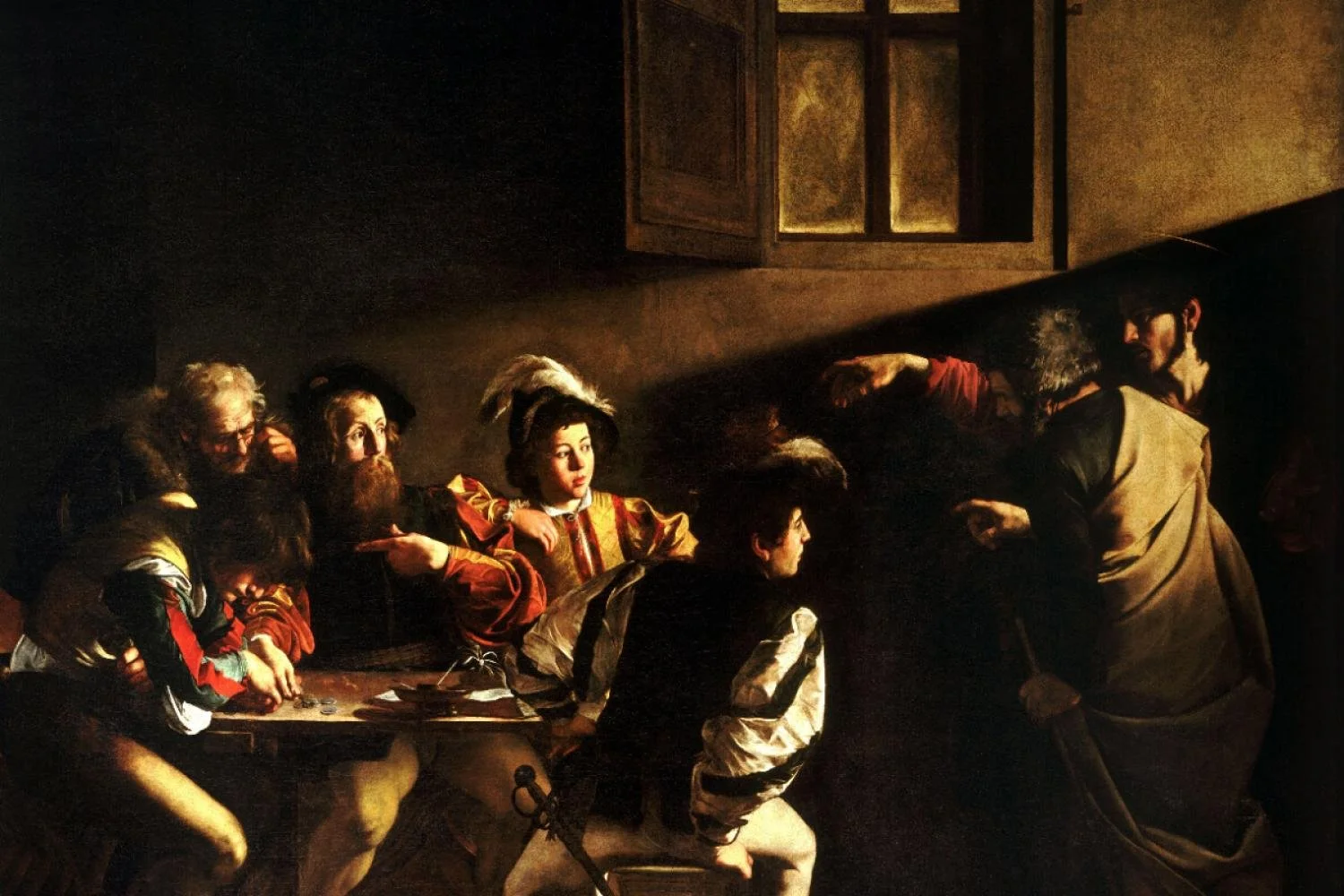
A major influence on Baroque art was the Catholic Church, especially during the Counter-Reformation. The Church wanted to inspire people’s faith and showcase its power in the face of the Protestant Reformation. To do this, they commissioned large, powerful works of art that depicted religious scenes with vivid realism. Artists like Caravaggio made Biblical stories feel immediate and relatable by using light to emphasize the emotion of a scene. Sculptors like Gian Lorenzo Bernini created works that invited viewers to step into the action, like his famous “Ecstasy of Saint Teresa,” which combines architecture and sculpture to create an immersive experience.
Baroque architecture also focused on grandeur and movement. Buildings like St. Peter’s Basilica in Rome, with its sweeping curves and lavish decorations, reflected the style’s emphasis on awe and splendor.
Artists like Rembrandt and Peter Paul Rubens brought the Baroque style to life in their own ways, using deep emotion and dramatic scenes to make their work stand out. Though the Baroque period eventually gave way to styles like Rococo and Neoclassicism, its influence on Western art remains strong, celebrated for its emotional depth and technical brilliance.
Ornate whispers call,
Motion spins through golden frames—
Grandeur fills the air.
Exploring the Golden Ratio in Art

The Golden Ratio, also known as the Divine Proportion or Phi (about 1.618), has captivated artists, architects, and mathematicians for centuries. This mathematical concept is celebrated for creating harmony and aesthetic appeal in various art forms. But how do artists use the Golden Ratio? Let's explore its fascinating applications.
The Golden Ratio comes from the Fibonacci sequence, where each number is the sum of the two before it (0, 1, 1, 2, 3, 5, 8, 13, etc.). As the sequence progresses, the ratio between successive numbers gets closer to the Golden Ratio (1.618). This unique proportion means the whole is to the larger part as the larger part is to the smaller, creating a visually pleasing effect.
The Golden Ratio has ancient roots, particularly in Greek culture, where mathematicians like Euclid and Pythagoras explored its properties. It gained prominence during the Renaissance, with artists like Leonardo da Vinci and Michelangelo using it in their masterpieces. The Vitruvian Man and the composition of The Last Supper are prime examples of the Golden Ratio creating balance and harmony.
How Artists Use the Golden Ratio
Artists often use the Golden Ratio to divide their canvases into appealing proportions. By placing focal points along the Golden Ratio lines, they create compositions that naturally attract the viewer's eye. This technique is found in classical paintings, photography, and modern graphic design, helping to achieve balance and elegance.
The human body is a central subject in art, and the Golden Ratio helps achieve idealized proportions. Leonardo da Vinci's Vitruvian Man is a perfect example, with the human form mapped according to the Golden Ratio. This principle helps artists create balanced and naturally pleasing figures.
The Golden Ratio extends beyond visual art into architecture and design. Iconic structures like the Parthenon in Athens, the Egyptian pyramids, and modern buildings like the Guggenheim Museum in New York use these proportions. This application is also found in everyday objects, from furniture to logos, ensuring functionality and visual appeal.
The Golden Ratio appears in nature too, not just human creations. Spiral patterns in shells, leaf arrangements, and even animal body proportions follow this ratio. Artists often draw inspiration from these natural examples, creating works that resonate with the beauty of the natural world.
The Golden Ratio's allure lies in its ability to create harmonious and balanced compositions. By understanding and applying this ratio, artists can enhance their work's aesthetic quality, drawing viewers in with a sense of natural beauty and proportion. Whether in ancient sculptures, Renaissance paintings, or contemporary designs, the Golden Ratio remains a timeless tool in the artist's toolkit.
"So how do you DO this?"
Behind the Scenes: my process
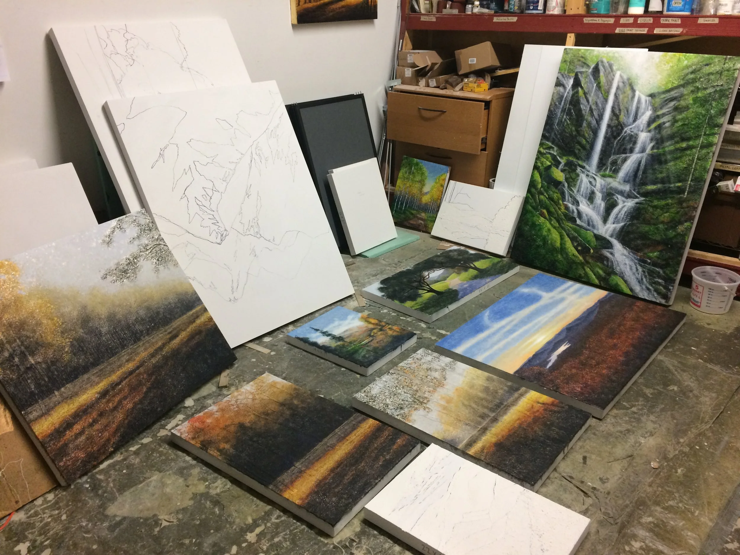
One of the things that’s most fun for me about my painting career is that I made up (or more accurately) am making up the technique every day I paint. To do that requires basic knowledge of color and proportions (thank you art school!) but the rest takes a sense of daring and exploration. It takes a huge dose of “I don’t care if I fail at this idea — I just want to see if this works” kind of attitude. About half of the main basic steps of what has become my technique were arrived at by exploring, and honestly, they were what I thought at the moment to be mistakes. But then the next day, I’d pull out the painting again and stare at it and (sometimes) be surprised at how the ingredients chemically reacted with each other overnight. Sometimes the result was horrendous; sometimes amazing. For the latter outcome, it was then a matter of trying to remember what all went into creating the results.
So what exactly is the technique I came up with? The core is a secret. It will be revealed at the reading of my will. Just kidding. :). But yeah, I don’t share everything. But here is what I DO share.
Step 1: Find some really good inspirational photos I can use for color reference.
Step 2: Create a pencil sketch on my canvas.
Step 3: Build up the sketch with layers and layers of gesso and modeling compound so that the sketch becomes dimensional
Step 4: Cover the entire textured surface of the painting with metallic leaf.
Step 5: Apply many layers of paint onto the surface.
Step 6: Seal the painting with either satin varnish or solar resistant resin.
That’s it! Easy huh? It’s actually not easy at all. Through the years, we’ve had to call chemists and pick their brains about why the paint did this or that. To develop this technique, I’ve made so many, many mistakes but that’s how you invent anything really. I kind of enjoy being half artist, half mad scientist. At least I’ve not blown up anything yet (that only happens when I’m in the kitchen).
Discovering the Bond Between Nature and Art
I think that the beauty and grandeur of nature has long been a profound source of inspiration for artists. From the intricate patterns of leaves to the vastness of landscapes, the natural world offers endless possibilities for creative expression. When an artist sees something awesome, he or she is compelled to express that awe. I wanted to take a few minutes and explore how nature and art intertwine, creating a harmonious relationship that has captivated artists and audiences alike for centuries.
Nature’s Role in Art
Nature serves as both a muse and a medium for artists. The beauty, diversity, and complexity of the natural world provide a rich tapestry of subjects to explore. Artists like J.M.W. Turner, for example, use elements from nature such as leaves, branches, and flowers to create stunning pieces that blur the lines between art and nature. Her work is a testament to the deep connection between the two, showcasing how natural elements can be transformed into captivating art.
Historical Insights
Throughout history, artists have turned to nature for inspiration. The Romantic movement in the 19th century, for instance, emphasized the sublime beauty of nature, with artists like John Constable and Caspar David Friedrich creating dramatic landscapes that evoke a sense of awe and wonder. Similarly, the Impressionists, including Renoir and Degas, captured the fleeting effects of light and color in their depictions of natural scenes.
Contemporary Views
In contemporary art, the connection between nature and art continues to evolve. Artists are increasingly using their work to address environmental issues and promote sustainability. The movement of sustainable art, for example, encourages us to think more deeply about our impact on the planet and how we can use art to foster a greater appreciation for the natural world.
Art as a Conservation Tool
Art has the power to raise awareness about environmental conservation. Organizations like Artists for Conservation use art to support nature through their work, often donating a portion of their sales to conservation efforts. This not only highlights the beauty of the natural world but also underscores the importance of preserving it for future generations.
Really, the connection between nature and art is a testament to the enduring bond between humanity and the natural world. Through art, we can celebrate, contemplate, and preserve the wonders of nature, ensuring that its beauty continues to inspire and enrich our lives. Whether through traditional landscapes or innovative sustainable art, the relationship between nature and art remains a powerful and dynamic force in the world of creativity.
Book Review: The Artist’s Way
If you’re an artist looking for a game-changer, you’ve got to check out “The Artist’s Way” by Julia Cameron. This book is often praised as a must-read for anyone wanting to unlock their creativity and get past those pesky creative blocks. I went through it years ago and it continues to encourage creativity in me every time I refer to it.
OVERVIEW: “The Artist’s Way” is set up as a 12-week program to help you tap into your creative potential. Cameron introduces some cool exercises and tools, like Morning Pages (daily writing exercises) and Artist Dates (solo outings to nurture your inner artist). These activities are all about self-discovery and artistic growth. These Artist Dates were my favorite part of the book. You don’t often take time to just rest your mind and play and discover. That’s something we’ve lost since we were kids. The whole concept helps you rediscover the joy of discovery and play.
KEY THEMES OF THE BOOK
Creative Recovery: The author talks a lot about getting back in touch with your creative self, which might have been buried under self-doubt, criticism, or just life in general.
Spiritual Path: The book takes a spiritual approach to creativity, encouraging you to see your artistic journey as a kind of spiritual practice.
Practical Exercises: Each chapter is packed with practical exercises and tasks to help you explore your creativity in a structured way.
IMPACT: Many artists and creatives swear by “The Artist’s Way” as a life-changing resource. It not only helps you overcome creative blocks but also deepens your connection with your artistic self. The book’s mix of practical exercises and spiritual insights makes it a unique and powerful guide for anyone looking to boost their creative journey.
Overcoming Artist’s Block: Practical Tips
“I look into my creative soul for an idea…ANY idea. And it’s just a dark, silent abyss. I have absolutely nothing creative going on in my head. What do I do to get that spark back?”
First of all, look…every artist faces artist’s block at some point. It can be frustrating, but it’s a natural part of the creative process, so please be kind to yourself. I don’t have a cure-all, but I do have a few ideas you might try that have helped me:
1. Start Creating Sometimes, the best way to overcome a block is to simply start. Put something—anything—on the canvas or sketch pad. It doesn’t have to be perfect. The act of creating can help break the inertia and get your creative juices flowing.
2. Change Your Surroundings A change of scenery can do wonders for your creativity. Travel, visit an art museum, or even just take a walk in a new neighborhood. New experiences can provide fresh inspiration and new perspectives.
“Creative block can be frustrating, but it’s a natural part of the creative process…”
3. Try Creative Exercises Engage in different creative exercises to stimulate your mind. This could be doodling, experimenting with new materials, or trying a different art style. These exercises can help you break out of your routine and spark new ideas.
4. Take a Break Sometimes, the best thing you can do is step away from your work. Take a break, do something you enjoy, and give yourself time to recharge. When you return to your art, you may find that you have a fresh perspective.
5. Seek Inspiration Look for inspiration in other artists’ work, read inspirational art quotes, or watch documentaries about artists. Seeing how others overcome their challenges can motivate you to push through your own block.
6. Set Small Goals Break your project into smaller tasks and set achievable goals. This can make the process feel less overwhelming and help you build momentum as you complete each step.
Trust me, artist’s block is a common challenge, but it doesn’t have to halt your creativity. Every artist goes through this at some point. Like it or not, it’s just part of the journey. If you have an idea for something that’s helped you, please by all means share that idea here in the comments!
Blog Archive
-
2026
- Jun 8, 2026 Conversations Across Time: Peter Paul Rubens Jun 8, 2026
- Apr 29, 2026 Conversations Across Time: Caravaggio Apr 29, 2026
- Apr 26, 2026 Conversations Across Time: Raphael Apr 26, 2026
- Apr 21, 2026 Conversations Across Time: Michelangelo Apr 21, 2026
- Apr 16, 2026 Conversations Across Time: Sandro Botticelli Apr 16, 2026
- Apr 11, 2026 Conversations Across Time: Donatello Apr 11, 2026
- Apr 6, 2026 Conversations Across Time: Jan van Eyck Apr 6, 2026
- Apr 1, 2026 Conversations Across Time: Leonardo da Vinci Apr 1, 2026
- Mar 29, 2026 A Closing Reflection: Nine Ways Beauty Finds Us Mar 29, 2026
- Mar 27, 2026 Type Nine: The Recognition of Wholeness Mar 27, 2026
- Mar 24, 2026 Type Eight: The Encounter with Unfiltered Reality Mar 24, 2026
- Mar 18, 2026 Type Seven: The Pursuit of Radiant Possibility Mar 18, 2026
- Mar 16, 2026 Type Six: Beauty as Trust, Stability, and the Restoration of Ground Mar 16, 2026
- Mar 11, 2026 Type Five: Beauty as Insight and Essential Understanding Mar 11, 2026
- Mar 8, 2026 Type Four: Beauty as Identity and Emotional Truth Mar 8, 2026
- Mar 5, 2026 Type Three: Beauty as Significance and Radiance Mar 5, 2026
- Mar 1, 2026 Type Two: Beauty as Loving Connection Mar 1, 2026
- Feb 26, 2026 Type One: The Pursuit of Perfected Beauty Feb 26, 2026
- Feb 22, 2026 Why Personality Shapes the Way We Create and Experience Art Feb 22, 2026
- Feb 11, 2026 My Most Ambitious Project to Date: Pont Neuf at Dusk Feb 11, 2026
- Feb 8, 2026 The Human Rhythm: Why the Golden Section Matters Feb 8, 2026
- Jan 31, 2026 Nature’s Quiet Mathematics: The Golden Section at Work Jan 31, 2026
- Jan 24, 2026 The Golden Section in Architecture: Building with Human Scale Jan 24, 2026
- Jan 16, 2026 The Golden Section in Music: Proportions You Can Feel Jan 16, 2026
- Jan 14, 2026 The Golden Ratio in Art: Where Math Meets Beauty Jan 14, 2026
-
2025
- Dec 25, 2025 Finding Peace in the Christmas Chaos Dec 25, 2025
- Dec 14, 2025 Seeing Meaning: How Medieval Art Spoke Without Words Dec 14, 2025
- Nov 19, 2025 The Matterhorn and the Magic of Transformation Nov 19, 2025
- Nov 13, 2025 Commissions vs Completed Pieces…Which is Right for You? Nov 13, 2025
- Oct 28, 2025 What can I learn from Makoto Fujimura in 2025? Oct 28, 2025
- Oct 12, 2025 What can I learn from Pablo Picasso in 2025? Oct 12, 2025
- Oct 10, 2025 What can I learn from Raphael in 2025? Oct 10, 2025
- Oct 8, 2025 What can I learn from Georgia O’Keefe in 2025? Oct 8, 2025
- Sep 28, 2025 What can I learn from Caravaggio in 2025? Sep 28, 2025
- Jul 25, 2025 What can I learn from Thomas Gainsborough in 2025? Jul 25, 2025
- Jul 20, 2025 What can I learn from Leonardo da Vinci in 2025? Jul 20, 2025
- Jul 15, 2025 What can I learn from Michelangelo in 2025? Jul 15, 2025
- Jul 2, 2025 What can I learn from Van Gogh in 2025? Jul 2, 2025
- Jun 25, 2025 What can I learn from Renoir in 2025? Jun 25, 2025
- Jun 23, 2025 What can I learn from Claude Monet in 2025? Jun 23, 2025
- Jun 21, 2025 Using Complimentary Colors for Shading Jun 21, 2025
- Jun 17, 2025 How and When to use Complimentary Colors Jun 17, 2025
- May 30, 2025 Perspective in Art 101: How to Make Your Drawings Pop Off the Page May 30, 2025
- May 26, 2025 How to Really Understand Medieval Art May 26, 2025
- May 22, 2025 Staying Creative May 22, 2025
- May 10, 2025 AT Experience May 10, 2025
- May 3, 2025 Go Take a Walk! May 3, 2025
- Apr 25, 2025 Periods of Art: Mannerism Apr 25, 2025
- Apr 17, 2025 Finding Meaning in the Abstract: Pointers for Understanding Modern Art Apr 17, 2025
- Apr 16, 2025 The Quiet Labor Apr 16, 2025
- Apr 12, 2025 To Art: a Poem Apr 12, 2025
- Apr 5, 2025 The Enchantment of Art Nouveau Apr 5, 2025
- Mar 23, 2025 "What was it like going to art school?" Mar 23, 2025
- Mar 18, 2025 Why I Love the Rococo Period Mar 18, 2025
- Mar 4, 2025 Expressing Joy Through Art Mar 4, 2025
- Feb 28, 2025 The Connection Between Art and Frustration Feb 28, 2025
- Feb 23, 2025 Neoclassicism: Bringing Ancient Style Back to Life Feb 23, 2025
- Feb 18, 2025 On my walk Feb 18, 2025
- Feb 12, 2025 Art at the Very Beginning Feb 12, 2025
- Feb 10, 2025 Monet and Renoir: A Personal Reflection on Their Differences Feb 10, 2025
- Feb 6, 2025 The Fount of Creation: A poem Feb 6, 2025
- Feb 1, 2025 The Connection Between Art and Grief Feb 1, 2025
- Jan 29, 2025 A Journey Through Medieval Art: Stories from the Middle Ages Jan 29, 2025
- Jan 26, 2025 The Story of Art: The Romantic Period Jan 26, 2025
- Jan 16, 2025 The Relationship Between Music and Painting Jan 16, 2025
- Jan 12, 2025 Periods of Art: Baroque Jan 12, 2025
- Jan 11, 2025 Marketing your Artwork Jan 11, 2025
- Jan 7, 2025 Exploring the Golden Ratio in Art Jan 7, 2025
- Jan 3, 2025 Artistic Enlightenment: Lessons from Italy Jan 3, 2025
-
2024
- Dec 29, 2024 Why Travel is Crucial for Unleashing Creativity Dec 29, 2024
- Dec 22, 2024 Steps to Becoming a Full-Time Professional Artist Dec 22, 2024
- Dec 10, 2024 How to Determine Subject Matter for Your Next Painting Dec 10, 2024
- Dec 3, 2024 My Favorite Artist Dec 3, 2024
- Dec 1, 2024 Creativity and Exploration Dec 1, 2024
- Nov 13, 2024 Impressionistic Heroes of Mine Nov 13, 2024
- Nov 10, 2024 "So how do you DO this?" Nov 10, 2024
- Nov 3, 2024 Discovering the Bond Between Nature and Art Nov 3, 2024
- Nov 1, 2024 How Art Can Help Us Cope with Stress Nov 1, 2024
- Oct 27, 2024 How to Select the Perfect Art for Your Home Oct 27, 2024
- Oct 24, 2024 What to Do When You Feel Like Giving Up as an Artist Oct 24, 2024
- Oct 14, 2024 Book Review: The Artist’s Way Oct 14, 2024
- Oct 11, 2024 How to find Inspiration for your art Oct 11, 2024
- Sep 24, 2024 Crafting the Perfect Title for Your Artwork Sep 24, 2024
- Sep 14, 2024 The Worst Advice I’ve Ever Received as an Artist Sep 14, 2024
- Sep 8, 2024 Overcoming Artist’s Block: Practical Tips Sep 8, 2024
- Aug 30, 2024 Exploring Lessons from Vincent van Gogh Aug 30, 2024
- Aug 29, 2024 Why Purchase Original Artwork? Aug 29, 2024
- Aug 25, 2024 How do you determine the best size artwork to purchase? Aug 25, 2024
- Aug 15, 2024 "So, what's this painting worth?" Aug 15, 2024
- Aug 9, 2024 What color art would go best in my home? Aug 9, 2024
- Aug 4, 2024 How to deal with criticism as an artist Aug 4, 2024
- Mar 27, 2024 Question 12: "What do you do when you have a mental block?" Mar 27, 2024
- Mar 27, 2024 New Goals + Winter Months = "Outside the Box" Creativity Mar 27, 2024
- Jan 8, 2024 Question 11: Where do you get inspiration for your work? Jan 8, 2024
-
2023
- Sep 11, 2023 Question 10: "Do you have your work in galleries?" Sep 11, 2023
- Aug 27, 2023 Question 9: "How do you manage the business side of your art business?" Aug 27, 2023
- Aug 20, 2023 Question 8: "Do you advertise?" Aug 20, 2023
- Aug 13, 2023 Question 7: "How do you price your work?" Aug 13, 2023
- Jul 30, 2023 Question 6: "What are the positive points and negative points about having an 'open studio'?" Jul 30, 2023
- Jul 19, 2023 Question 5: "Would you mind critiquing my work at some point?" Jul 19, 2023
- Jul 1, 2023 Question 4: "Would you recommend art school, and if so, how would you find the right one?" Jul 1, 2023
- Jun 24, 2023 Question 3: "Did you go to art school? If so, where?" Jun 24, 2023
- Jun 16, 2023 Question 2: "How long have you been selling your work professionally?" Jun 16, 2023
- Jun 10, 2023 Question 1..."How long have you been an artist?" Jun 10, 2023
- Jun 4, 2023 So, you're thinking about art as a career? Jun 4, 2023
- Mar 3, 2023 "What inspires you as an artist?" Mar 3, 2023
- Feb 15, 2023 Should I buy a completed painting OR commission a painting? Feb 15, 2023
- Jan 23, 2023 "How do you Price Your Work?" Jan 23, 2023
-
2022
- Dec 1, 2022 An Artist in Italy (Part 3) Dec 1, 2022
- Nov 16, 2022 An Artist in Italy (Part 2) Nov 16, 2022
- Nov 8, 2022 An Artist in Italy (Part 1) Nov 8, 2022
- Oct 10, 2022 When Remodeling a Home... Oct 10, 2022
- Aug 22, 2022 How to Handle Failure Aug 22, 2022
- Jun 3, 2022 "What is it like being an artist these days?" Jun 3, 2022
- May 21, 2022 "Are All Artists Introverts?" May 21, 2022
- May 9, 2022 What Makes a Painting a Good Piece of Art? May 9, 2022
- Apr 1, 2022 The Story Behind…"Gentle Showers on a Summer Afternoon" Apr 1, 2022
- Mar 19, 2022 The Story Behind..."Blue Ridge Summer Afternoon" Mar 19, 2022
- Feb 18, 2022 Your Opinion Please... Feb 18, 2022
- Jan 22, 2022 What's in a Compliment? Jan 22, 2022
-
2021
- Dec 25, 2021 My Christmas Present to Joy Dec 25, 2021
- Dec 12, 2021 Deep in the Heart Dec 12, 2021
- Nov 29, 2021 "How do you know you're done with a painting?" Nov 29, 2021
- Nov 1, 2021 Does it Matter What Other People Think of My Art? Nov 1, 2021
- Oct 12, 2021 Creatively Inhaling... Oct 12, 2021
- Aug 31, 2021 More Fun than I Know What to do With Aug 31, 2021
- Aug 13, 2021 “Are You Self Taught?” Aug 13, 2021
- Jul 21, 2021 New Art Gallery on the West Coast Jul 21, 2021
- Jun 23, 2021 "Art from the Heart" vs "Commissioned Art" Jun 23, 2021
- May 28, 2021 More Questions and Answers May 28, 2021
- May 17, 2021 What does Diversity have to do with honest artwork? May 17, 2021
- May 4, 2021 More Questions and Answers May 4, 2021
- Apr 30, 2021 Questions and Answers Apr 30, 2021
- Apr 16, 2021 And the Next Blog Post is... Apr 16, 2021
- Mar 10, 2021 How do you create when you don't feel like creating? Mar 10, 2021
- Feb 11, 2021 "Mullaghmore": The Story Behind the Painting Feb 11, 2021
- Jan 28, 2021 A Look Back to "The Dark Year" Jan 28, 2021
- Jan 17, 2021 Studio Expansion...Hello Northeast! Jan 17, 2021
- Jan 7, 2021 How to Create the Perfect Painting Jan 7, 2021
-
2020
- Dec 1, 2020 A personal answer to a personal question... Dec 1, 2020
- Nov 4, 2020 Using Art to Express my Politics Nov 4, 2020
- Oct 16, 2020 Sometimes, just "having fun" is a good enough reason Oct 16, 2020
- Oct 4, 2020 The Best Painting Delivery Ever... Oct 4, 2020
- Sep 7, 2020 How a Dinky Little Virus Changed my Art Business Sep 7, 2020
- Aug 9, 2020 Adaptation: Survival of the Most Flexible Aug 9, 2020
- Aug 3, 2020 Story Behind the Painting: "Sundown over the Blue Ridge" Aug 3, 2020
- Jul 18, 2020 Cure for Covid blues Jul 18, 2020
- Jul 5, 2020 Where Does it Take You? Jul 5, 2020
- Jun 3, 2020 Story Behind the Painting: Autumn Day on the French Broad River Jun 3, 2020
- May 24, 2020 Story Behind the Painting: Saint-Jean-Cap-Ferrat May 24, 2020
- Apr 30, 2020 Q&A: SESSION TWO Apr 30, 2020
- Apr 22, 2020 Q&A: SESSION ONE Apr 22, 2020
- Apr 8, 2020 What I'll Miss When This Pandemic is Over... Apr 8, 2020
- Mar 20, 2020 Entertaining Angels Unawares Mar 20, 2020
- Mar 8, 2020 In Celebration of Art Mar 8, 2020
- Feb 27, 2020 "The Bridge" Feb 27, 2020
- Feb 8, 2020 The Most Interesting Question of the Year (but it's only February so...) Feb 8, 2020
- Jan 29, 2020 "Can I Watch You?" Jan 29, 2020
- Jan 14, 2020 From Point A to Point Z Jan 14, 2020
- Jan 5, 2020 An Impractical Idea Jan 5, 2020
-
2019
- Dec 17, 2019 My Beautiful Baby on Display Dec 17, 2019
- Dec 3, 2019 Regarding the Selection of an Artistic Theme Dec 3, 2019
- Nov 20, 2019 "What's Your Best Price on This Piece?" Nov 20, 2019
- Nov 13, 2019 A Really Unique Commission Project Nov 13, 2019
- Nov 6, 2019 Fun with Art Scammers Nov 6, 2019
- Nov 3, 2019 "How did you know you wanted to be an artist?" Nov 3, 2019
- Oct 30, 2019 How do you know when a painting is "done"? Oct 30, 2019
- Oct 20, 2019 The piece I had to paint: "Côte d’Azur" Oct 20, 2019
- Oct 18, 2019 Inspiration Everywhere! Oct 18, 2019
- Aug 26, 2019 Contentment vs Restlessness Aug 26, 2019
- Aug 14, 2019 "Why Should I Purchase Artwork?" Aug 14, 2019
- Aug 11, 2019 What Was Art School Like? Aug 11, 2019
- Aug 7, 2019 "The Four Seasons on the French Broad River" Aug 7, 2019
- Jul 30, 2019 Joy Unspeakable Jul 30, 2019
- Jul 7, 2019 Of Mountains and Oceans Jul 7, 2019
- Jul 3, 2019 Lessons I've Learned as an Artist Jul 3, 2019
- Jun 26, 2019 St.Claire Art Opening at the AC Hotel, Asheville Jun 26, 2019
- Jun 23, 2019 "How do you decide what to paint?" Jun 23, 2019
- Jun 5, 2019 One of my All-Time Heroes Jun 5, 2019
- Jun 2, 2019 Regarding "Inspiration" vs "Necessity" Jun 2, 2019
- May 29, 2019 The Best Complement I've Ever Received May 29, 2019
- May 19, 2019 "What are you Working on These Days?" May 19, 2019
- May 5, 2019 "Frankenstein-ing" a painting May 5, 2019
- Apr 17, 2019 The Big Reveal Apr 17, 2019
- Apr 3, 2019 "How do you Decide What to Paint?" Apr 3, 2019
- Mar 27, 2019 "I'm just not making the sales I need!" Mar 27, 2019
- Mar 20, 2019 Making the Most of Mistakes Mar 20, 2019
- Mar 10, 2019 Exploring Austin Galleries, Part 2 Mar 10, 2019
- Feb 25, 2019 Exploring Austin Galleries, Part 1 Feb 25, 2019
- Feb 10, 2019 Progress! Feb 10, 2019
- Jan 23, 2019 Preliminary Photos of my "Sails" Prototypes Jan 23, 2019
- Jan 16, 2019 The Benefits of Slowing Down Jan 16, 2019
- Jan 8, 2019 New Idea Taking Shape Jan 8, 2019
-
2018
- Dec 29, 2018 Looking Back and Looking Ahead Dec 29, 2018
- Dec 19, 2018 Percolating Creativity Dec 19, 2018
- Dec 16, 2018 So then... Dec 16, 2018
- Dec 12, 2018 What if... Dec 12, 2018
- Dec 5, 2018 Recent Projects on my Plate Dec 5, 2018
- Dec 3, 2018 Claude: My Creative Hero and Muse Dec 3, 2018
- Nov 22, 2018 Lessons I've Learned as an Artist Nov 22, 2018
- Nov 12, 2018 Planning for a Second Studio Location! Nov 12, 2018
- Nov 7, 2018 Steps Involved with a Painting Commission Nov 7, 2018
- Nov 4, 2018 How do you stay "balanced"? Nov 4, 2018
- Oct 28, 2018 What makes art "Art"? Oct 28, 2018
- Oct 21, 2018 "How Did You Stumble Across This Type of Artwork?" Oct 21, 2018
- Oct 17, 2018 "A Personal History" Oct 17, 2018
- Oct 14, 2018 Commission Confusion Oct 14, 2018
- Oct 10, 2018 "Aqueous Dream" Oct 10, 2018
- Oct 7, 2018 Beauty in the Center of the Pit Oct 7, 2018
- Sep 30, 2018 Only North Carolina? Sep 30, 2018
- Sep 23, 2018 The Price of Being a Landscape Painter Sep 23, 2018
- Sep 9, 2018 Thoughts on New Directions, New Possibilities Sep 9, 2018
- Aug 29, 2018 SURVEY: GLOSSY OR SATIN Aug 29, 2018
- Aug 22, 2018 Regarding Commissioning a Painting Aug 22, 2018
- Aug 19, 2018 On the Brink of a Huge Failure Aug 19, 2018
- Aug 7, 2018 "The Trail That Never Ends" Aug 7, 2018
- Aug 5, 2018 Inspration Begets Inspiration Aug 5, 2018
- Jul 19, 2018 Rejuvenating Creativity! Jul 19, 2018
- Jul 15, 2018 A Word About Accolades Jul 15, 2018
- Jul 10, 2018 Where it Began Jul 10, 2018
- Jul 4, 2018 Funny Things People Say in an Art Studio Jul 4, 2018
- Jun 29, 2018 "The Time Between Times" Jun 29, 2018
- Jun 27, 2018 World View #8: Post Modernism Jun 27, 2018
- Jun 21, 2018 World View #7: New Age Pantheism Jun 21, 2018
- Jun 12, 2018 A New Opportunity -- A New Idea Jun 12, 2018
- Jun 6, 2018 The Art of Dinner (at the Grove Park Inn) Jun 6, 2018
- Jun 3, 2018 National Geographic?!? Jun 3, 2018
- Jun 1, 2018 World View #6: Modernism Jun 1, 2018
- May 24, 2018 The Art of Dinner (with the Dallas Cowboys) May 24, 2018
- May 13, 2018 Carving Mountains from Scratch May 13, 2018
- May 10, 2018 "Trigger Warning" May 10, 2018
- May 7, 2018 World View #5: Existentialism May 7, 2018
- Apr 29, 2018 World View #4: Nihilism Apr 29, 2018
- Apr 11, 2018 World View #3: Naturalism Apr 11, 2018
- Apr 4, 2018 World View #2: Deism Apr 4, 2018
- Mar 26, 2018 World View #1: Theism Mar 26, 2018
- Mar 23, 2018 A Time to be Disturbed Mar 23, 2018
- Mar 14, 2018 Understanding Art 101 Mar 14, 2018
- Mar 8, 2018 The Organ Mountains Mar 8, 2018
- Mar 7, 2018 "Remember...there are no mistakes with art" Mar 7, 2018
- Mar 2, 2018 The Biltmore Estate Mar 2, 2018
- Feb 21, 2018 How to Make a Living as an Artist (Part 2) Feb 21, 2018
- Feb 12, 2018 How to Make a Living as an Artist Feb 12, 2018
- Feb 4, 2018 How do you create when you don't feel creative? Feb 4, 2018
- Jan 24, 2018 Gallery Representation in Hendersonville! Jan 24, 2018
- Jan 19, 2018 Metalizing the Biltmore Estate Jan 19, 2018
- Jan 15, 2018 Four Seasons on the Blue Ridge Jan 15, 2018
- Jan 11, 2018 About Ice... Jan 11, 2018
- Jan 10, 2018 What's Next? Jan 10, 2018
-
2017
- Dec 20, 2017 Mountain Top Experiences Dec 20, 2017
- Dec 18, 2017 The Power of Mystery Dec 18, 2017
- Dec 7, 2017 Forsyth Park Fountain Dec 7, 2017
- Dec 6, 2017 Angsty or Terrified? Dec 6, 2017
- Dec 4, 2017 To the "Angsty" Artist... Dec 4, 2017
- Dec 3, 2017 "I woudn't pay HALF of what he's asking!" Dec 3, 2017
- Nov 20, 2017 "On the Water" Nov 20, 2017
- Nov 19, 2017 Song of Autumn Nov 19, 2017
- Nov 15, 2017 "Top of the Mountain" Nov 15, 2017
- Nov 5, 2017 "How do you decide what to paint?" Nov 5, 2017
- Nov 2, 2017 "Valley of Shadows" Nov 2, 2017
- Nov 1, 2017 Forest of Autumn Gold Nov 1, 2017
- Oct 25, 2017 Then and Now Oct 25, 2017
- Oct 24, 2017 Catawba Falls Oct 24, 2017
- Oct 18, 2017 "Valley of Shadows" Oct 18, 2017
- Oct 11, 2017 Autumn River Song Oct 11, 2017
- Oct 3, 2017 Autumnal Shift Oct 3, 2017
- Sep 28, 2017 Mystic Summer Morning Sep 28, 2017
- Sep 24, 2017 Valley of Shadows Sep 24, 2017
- Sep 1, 2017 the breakers Sep 1, 2017
- Aug 24, 2017 When the Sun Went Dark Aug 24, 2017
- Aug 17, 2017 Secret Blog Post Aug 17, 2017
- Aug 14, 2017 Waterfalls Everywhere! Aug 14, 2017
- Aug 11, 2017 "Cullasaja Falls" Completion photo Aug 11, 2017
- Aug 8, 2017 Finishing up "My Marathon" Aug 8, 2017
- Aug 1, 2017 One of the Best Days Ever! Aug 1, 2017
- Jul 26, 2017 "Glacial Fractures in situ" Jul 26, 2017
- Jul 24, 2017 Inspiration and Rest Jul 24, 2017
- Jul 18, 2017 Half Baked Ideas... Jul 18, 2017
- Jul 13, 2017 Oaks on the Water Jul 13, 2017
- Jul 9, 2017 Challenged to the Core Jul 9, 2017
- Jul 5, 2017 Boats on the Water Jul 5, 2017
- Jun 30, 2017 Glacial Fractures Jun 30, 2017
- Jun 29, 2017 Winter in the Summer! Jun 29, 2017
- Jun 27, 2017 What's in a Compliment? Jun 27, 2017
- Jun 23, 2017 Thoughts on a Mighty Failure Jun 23, 2017
- Jun 20, 2017 Sunrise on the Mountain Jun 20, 2017
- Jun 14, 2017 The Last Sunset (is that dramatic or what?) Jun 14, 2017
- Jun 12, 2017 Sunset or Sunrise? End or Beginning? Jun 12, 2017
- Jun 9, 2017 At the End of the Day Jun 9, 2017
- Jun 8, 2017 Giverny: My Homage to the Man Jun 8, 2017
- Jun 2, 2017 A Funny Thing Happened at the Studio Today... Jun 2, 2017
- Jun 2, 2017 Sunrise, Sunset... Jun 2, 2017
- May 29, 2017 Color Explosion May 29, 2017
- May 22, 2017 My Largest Painting to Date... May 22, 2017
- May 18, 2017 What to do with 2000 visitors in an art studio... May 18, 2017
- May 9, 2017 My Creative Muse May 9, 2017
- May 3, 2017 Joys of Life May 3, 2017
- Apr 28, 2017 Regarding Art & Beauty Apr 28, 2017
- Apr 25, 2017 Getting Better Acquainted Apr 25, 2017
- Apr 23, 2017 Rainy Sunday Morning Thoughts Apr 23, 2017
- Apr 22, 2017 Personal Thoughts Apr 22, 2017
- Apr 19, 2017 Favorite Hikes (Inspiration in the Making)... Apr 19, 2017
- Apr 15, 2017 Inspiration is Everywhere (some of our favorite hiking trails) Apr 15, 2017
- Apr 9, 2017 "Where should we eat tonight?" Apr 9, 2017
- Apr 6, 2017 Who Else Should We See in the District? Apr 6, 2017
- Apr 1, 2017 Spring in Western North Carolina Apr 1, 2017
- Mar 29, 2017 "Can you really make a living here?" Mar 29, 2017
- Mar 25, 2017 Of Ruination and Rescue Mar 25, 2017
- Mar 21, 2017 How I decide what to paint... Mar 21, 2017
- Mar 18, 2017 Musings of an artist... Mar 18, 2017
- Mar 14, 2017 Winter thoughts Mar 14, 2017
- Mar 13, 2017 "What makes this painting so sparkly?" Mar 13, 2017
- Mar 10, 2017 You're From Where? Mar 10, 2017
- Mar 5, 2017 "No Boundaries" Mar 5, 2017
- Mar 3, 2017 Appalachian Trail Mar 3, 2017
- Mar 2, 2017 What is 'good' art? Mar 2, 2017
- Feb 26, 2017 A Trip to the Art Museum Feb 26, 2017
- Feb 23, 2017 "The Rules" of Art Feb 23, 2017
- Feb 15, 2017 To School or Not to School... Feb 15, 2017
- Feb 10, 2017 How Do I Start This Thing? Feb 10, 2017
- Feb 9, 2017 Rocky Mountains reflection Feb 9, 2017
- Feb 7, 2017 Getting Inspired Feb 7, 2017
- Feb 5, 2017 Inspiration for a painting... Feb 5, 2017
- Jan 31, 2017 Understanding Abstract Art Jan 31, 2017
- Jan 29, 2017 Chi Jan 29, 2017
- Jan 26, 2017 Process: Rocky Mountain Commission Jan 26, 2017
- Jan 12, 2017 "Summer Path Thru the Birch Trees" Jan 12, 2017
- Jan 9, 2017 "Daybreak" Jan 9, 2017
-
2016
- Dec 31, 2016 Revisiting a friend Dec 31, 2016
- Dec 28, 2016 The Trial Run Dec 28, 2016
- Dec 17, 2016 Asheville Channel Interview Dec 17, 2016
- Nov 28, 2016 "Big Mamma" begins to sing.... Nov 28, 2016
- Nov 22, 2016 An Experiment with Moonlight Nov 22, 2016
- Nov 17, 2016 Transfiguration Nov 17, 2016
- Nov 11, 2016 My Cluttered World Nov 11, 2016
- Oct 30, 2016 Sacred Space Oct 30, 2016
- Oct 22, 2016 Omikron (Fire & Ice) Oct 22, 2016
- Oct 19, 2016 "Do you know what you're going to paint?" Oct 19, 2016
- Oct 15, 2016 "Golden Pathway" Oct 15, 2016
- Oct 14, 2016 Flowers, Flowers Everywhere Oct 14, 2016
- Oct 13, 2016 OKC 2 ("The Bridge") Oct 13, 2016
- Oct 12, 2016 Headed west... Oct 12, 2016
- Sep 7, 2016 A Year of "Largest" Sep 7, 2016
- Aug 2, 2016 Transformation of an idea... Aug 2, 2016
- Jul 27, 2016 Beginning my "marathon" painting: Cullasaja Falls Jul 27, 2016
- Jul 18, 2016 My Marathon Jul 18, 2016
- Jul 13, 2016 Welcome! Jul 13, 2016
- Jul 11, 2016 Aegean Waters Jul 11, 2016
- Jul 2, 2016 The Red Planet Jul 2, 2016
- Jun 17, 2016 Puzzling and Playing Jun 17, 2016
- Jun 10, 2016 St.Claire Art Studio Tour Jun 10, 2016
- Jun 6, 2016 Hominy Valley Jun 6, 2016
- May 25, 2016 "The Acolytes" is installed in Georgetown, SC May 25, 2016
- May 19, 2016 "Zuma" May 19, 2016
- May 18, 2016 Fishy Art May 18, 2016
- May 13, 2016 "The Journey" May 13, 2016
- May 10, 2016 Hyatt Ridge (26" x 16") May 10, 2016
- May 5, 2016 "Broad River in October" May 5, 2016
- May 2, 2016 A Blast From the Past May 2, 2016
- Apr 22, 2016 Beginnings II Apr 22, 2016
- Apr 21, 2016 Appalachian Panorama Apr 21, 2016
- Apr 18, 2016 "How do you get the aluminum on the painting?" Apr 18, 2016
- Apr 14, 2016 Beginnings Apr 14, 2016
- Mar 24, 2016 St. Claire Art News & Updates Mar 24, 2016
- abstract
- aluminum leaf
- Appalachian Trail
- art as a career
- art business
- art career
- art career advice
- art commission
- art composition
- art creation
- art critique
- art education
- Art Gallery
- art gallery
- art history
- art inspiration
- art marketing
- art movements
- art periods
- art poetry
- art process
- art purchase
- art sales
- art school
- Art Studio
- art studio
- art studios
- Art Studios
- art technique
- artist
- Artist advice
- artist advice
- artist representation
- artisti creation
- artistic expression
- artistic inspiration
- artwork
- Artwork
- Asheville
- asheville
- Asheville art gallery
- Asheville art studio
- Asheville artist
- Asheville artists
- Autumn
- autumn
- birch
- blue
- Blue Ridge
- commission
- Commission
- complimentary colors
- contemporary art
- creative inspiration
- Creativity
- creativity
- cullasaja falls
- fine art
- golden section
- grief
- grove park inn
- Hiking
- impressionism
- inspiration
- installation art
- landscapes
- medieval art
- mountain trails
- mountains
- North Carolina
- ocean
- ocean artwork
- oil painting
- Oil paintings
- origins
- process
- Professional artist
- red
- reflection
- Renoir
- Resin art
- River
- River Arts District
- Statement peice
- studio
- summer
- sunset
- Sunset
- travel
- travel and creativity
- trees
- understanding art
- unique wall art
- water
- waterfall
- wave
- western north carolina
- Western North Carolina
- woods
- World Views