
What's in a Compliment?
Back in the day (when art classes in school were viewed as crucial for a well-rounded education), our art teachers probably taught us about the color wheel and we learned that colors opposite to each other on the wheel looked especially good together. These "opposite" colors are called "complimentary" to each other. This is all pretty basic stuff, Art101, but there is an actual scientific explanation why complimentary colors (yellow with purple, red with green, orange with blue) look so good with each other. See, it turns out that complementary colors are BFF's because cells in your eyes perceive various colors differently. For you doubters, try staring at a sheet of orange paper for a few minutes, then, look at a white wall. What do you see? Well, I'll tell you -- you will see a blue afterimage—orange's opposite color. This is because the cells in your eyes became tired, and do not fully express the visual spectrum you’ve been staring at. What you see on the wall is the white spectrum of light, sans a bit of blue, which your brain processes as orange.
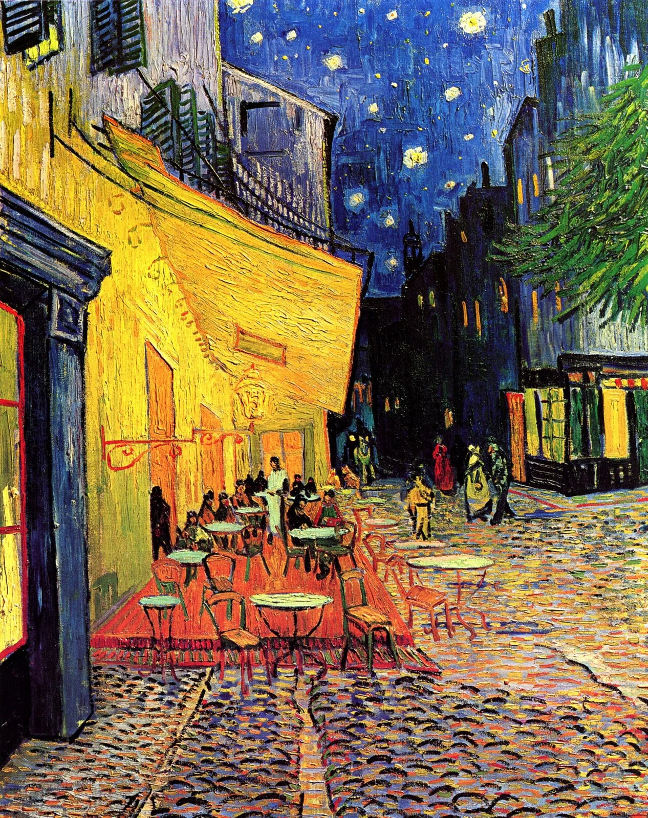
Science and anatomy aside, complimentary colors are used all the time by designers and artists to visually accent a color. If a painting is mostly green landscape, I will always figure out where to use some red. If the piece is a sunset with fiery oranges and yellows, I will use blue and violet in the shadows. That blue and violet will not only look nice with the warm colors in the sky, but will also make them look even more intense.
Second use of a compliment...

But a second way I use complimentary colors (literally all the time, every day I paint) is to gray down an intense color straight from the tube. Let me explain. I'm looking out my art studio window right now and I see trees. What color are trees? Green, of course. So we pull out our tube and Sap green or Viridian green and paint the trees, right? Wrong! When you look closer at the green trees, they are not just a single generic green. Some of the green is more yellow, some is more blue and cool, and some is more of a gray-green. So how would you gray down a green? Add black? NO! Sorry for yelling. Never use black. All you do is to add just a bit of the complimentary color (in the case of green, this would be red) and viola! It's perfect. No black. Truth be told, I never, ever use black.
So, the use of complimentary colors are to painting what making a basic brown sauce is to French cooking. It's really basic and by tweaking it, you can use it for so many different and wonderful applications.
Okay, back to painting...