
Art Blog
This blog is for posting photos of new artwork and for the expression of sometimes random thoughts of oil painter Stephen St. Claire.
One of the Best Days Ever!
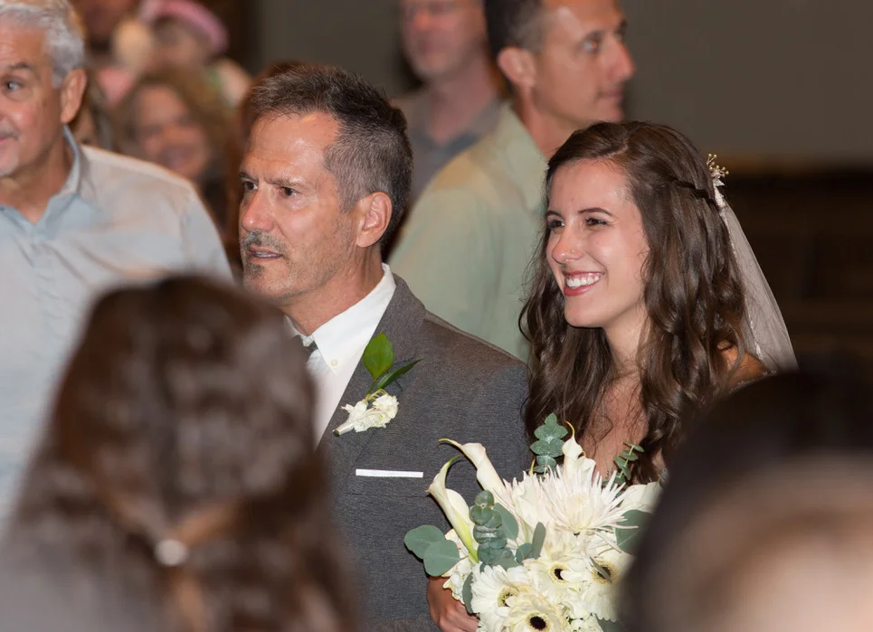
Me with my amazingly beautiful daughter Ceilidh on her wedding day (July 28, 2017)
Of all the creative works my wife Joy and I have been involved with, there is none like this. We work at an art studio in Asheville, North Carolina and have created literally hundreds of oil paintings; landscapes and abstract. We've experimented with different textures and glazes. And we have a great deal of joy and healthy pride when it comes to what we create. But honestly, it all pales to the family of six that began with just us two. Our children were and continue to be the most wonderful and challenging and rewarding creative projects we have ever dreamed of taking on. And this last Friday night, in Cleburne, TX, our last and youngest child (our daughter Ceilidh) was married. There is no way to describe the satisfaction, happiness and pride I feel because of her. She chose a wonderful guy, Schyler Shaffer who has been embraced by my whole family as being every bit as weird and wonderful as they are (good thing!)
Ceilidh and Schyler,
‘“The Lord bless you
and keep you;
the Lord make his face shine on you
and be gracious to you;
the Lord turn his face toward you
and give you peace.”
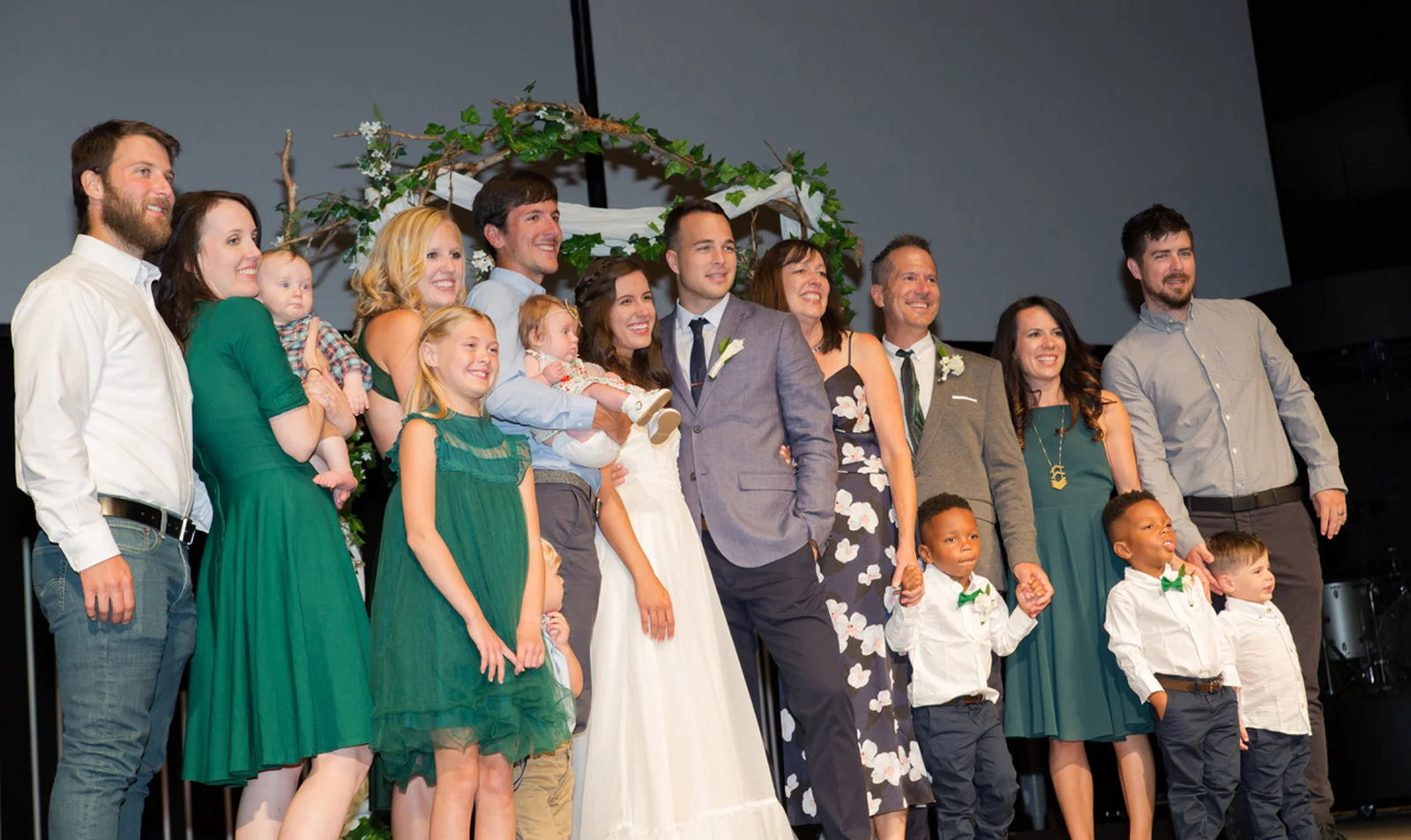
All my kids and grandchildren. So thankful for these people.
"Glacial Fractures in situ"
"Glacial Fractures" (45" x 70")
Every now and then, I receive a very welcomed email from a client that a includes a photo of one of my paintings hanging in it's new home. The piece shown here, entitled "Glacial Fractures", was shipped to Chicago and is now part of someone's home. Honestly, this is still so weird and wonderful to me -- the idea that I can express myself very personally on a canvas, and then that part of me -- this "thing" I made is now detached from me completely and becomes part of the life and home of another. It's pretty cool really. It's kind of like conceiving and giving birth to a baby daughter, watching her grow up and then leave you to get married (moving to Chicago in this case). Sorry for the lame analogy, but my daughter Ceilidh IS getting married this Friday so I have that whole theme on the front burner of my brain right now. So exciting.
Back to Business...
Next week, I'm back in my art studio in Asheville and though I've absolutely enjoyed the break, I'm really anxious to get back to the paintings I started a couple weeks ago, and I'm really enthused to get going on some brand new ideas I have now (this always happens when I take time to rest).
And (drum roll)...I will actually be finishing up my "Big Mama" 6' x 8' painting this next week. More on that to come. This of course means that this piece, "Cullesaja Falls" will have taken a full year to complete. Whew!
Inspiration and Rest
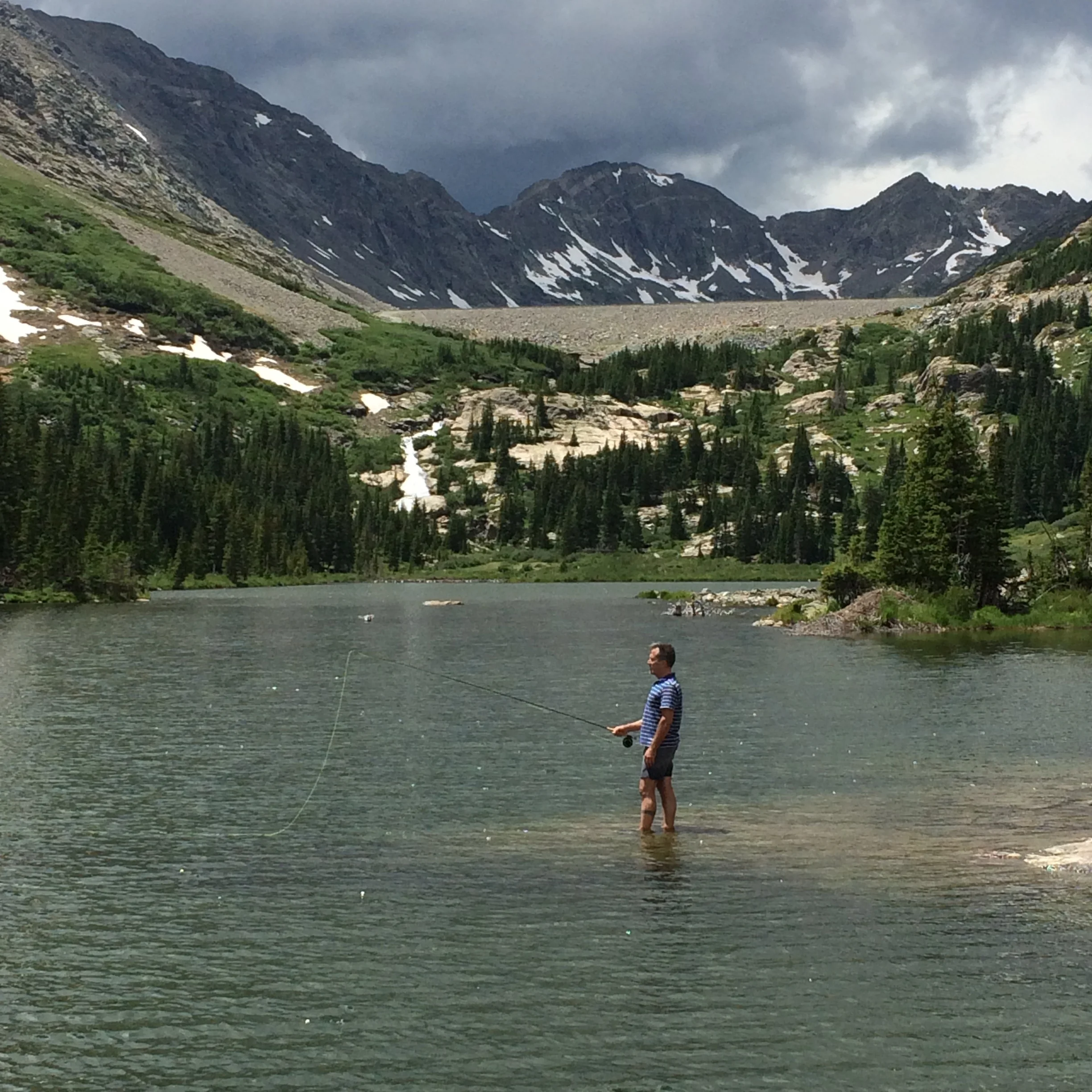
Fishing on the lower Blue Lake, Breckenridge, CO
Last week, my whole family (kids and grandchildren) were given the opportunity to spend time at a cabin of some friends/clients in Breckenridge, CO. We spent the week hiking, biking, fishing and a lot of laughing (especially during endless games of Settlers of Catan). If you ever need to be recharged and inspired, the Rocky Mountains will do the trick. Awesome and severe and covered with wildflowers this time of year, we left them inspired and ready to dive back into the Asheville summer season!
I enjoy my job so much as a painter in my studio in Asheville's River Arts District. I usually am not even aware of the fact that it would be good to get a break. See, painting FEELS like my "break" and I get to do that five days a week. For those of you who have purchased my artwork...THANK YOU for giving me the privilege of doing what I love to do. It's not lost on me that I can joyfully create because people like you support and encourage me by actually purchasing what I create.
But I can get so blissfully caught up in the creating of art that it's really easy to miss the fact I need a break, and that even with art, I need to take time to recharge and to fill my depleting creative tank.
Well, now that creative tank is full again. I left the Rocky Mountains rested and inspired and with some new ideas I want to try. If these ideas work, then some exciting things are in the making in the next few months, and I'm really excited about that.
Half Baked Ideas...
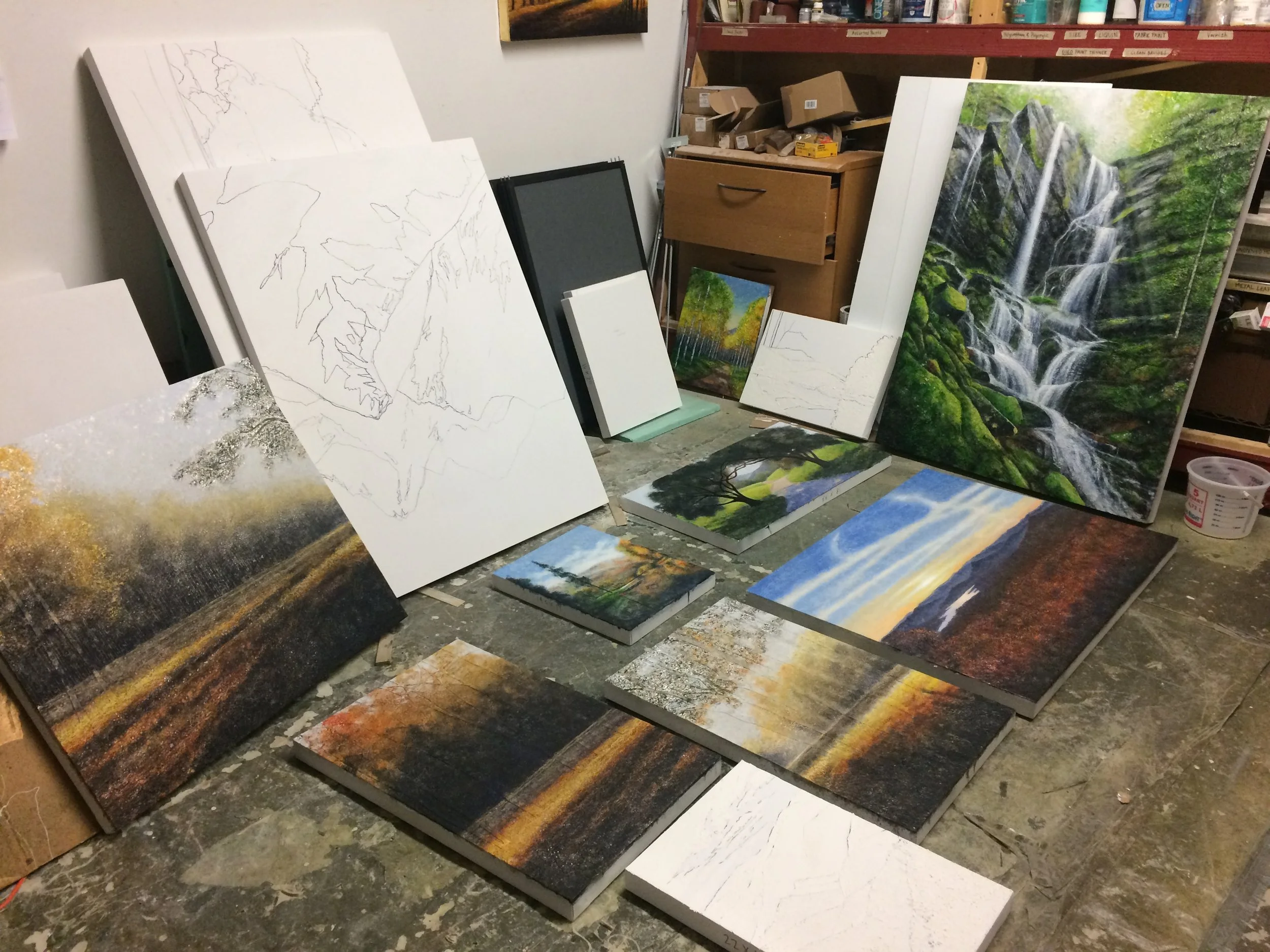
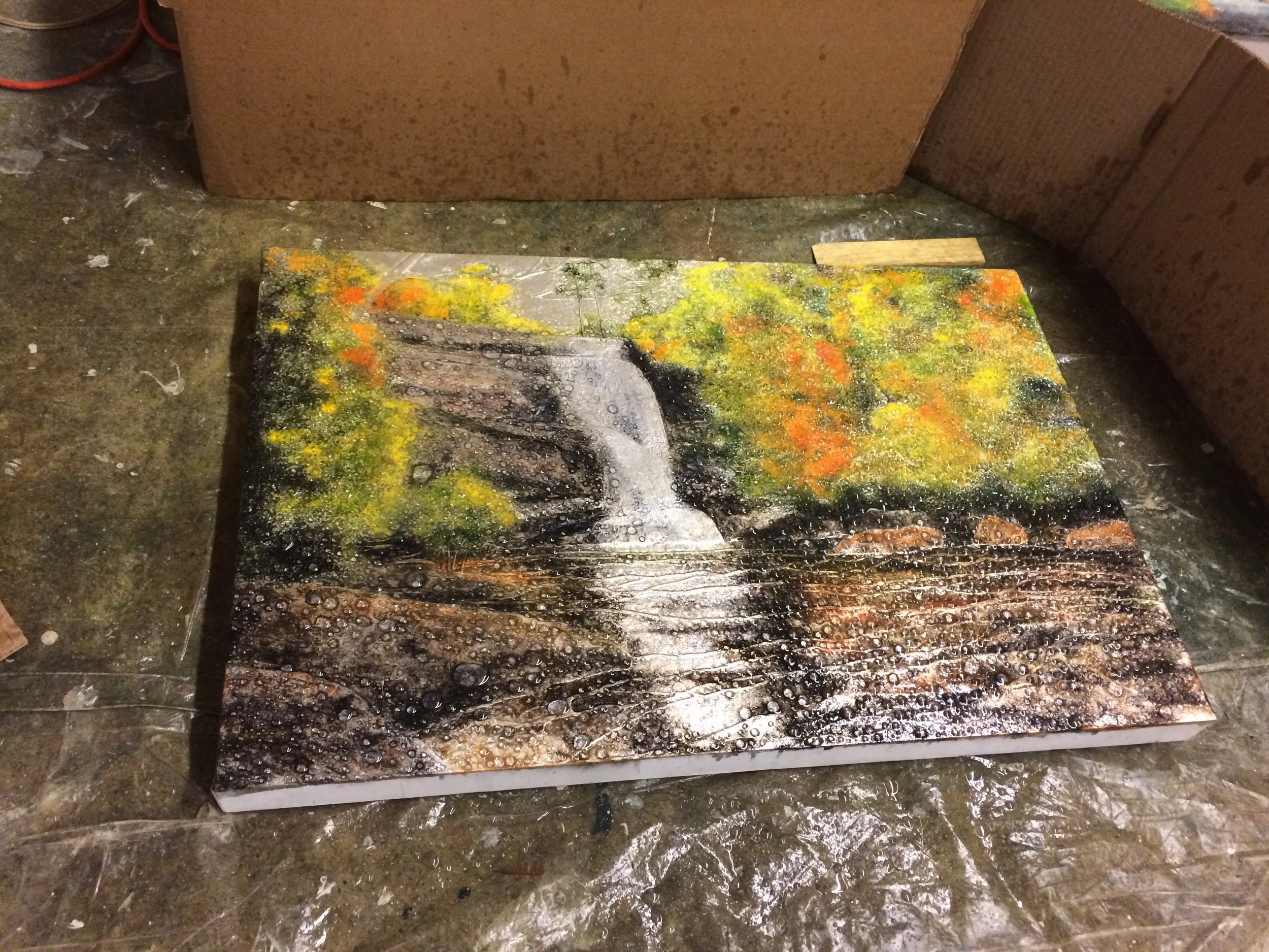
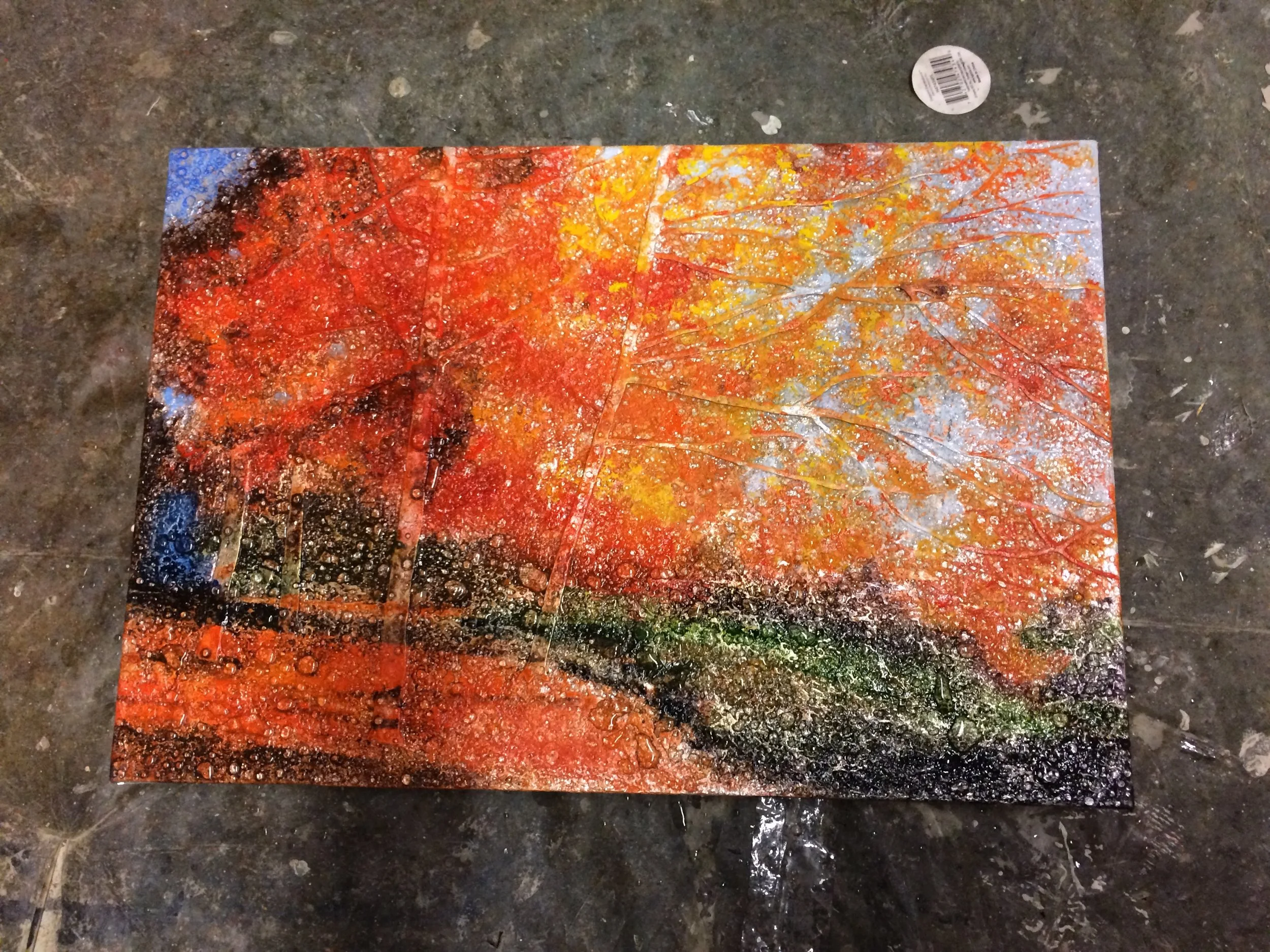
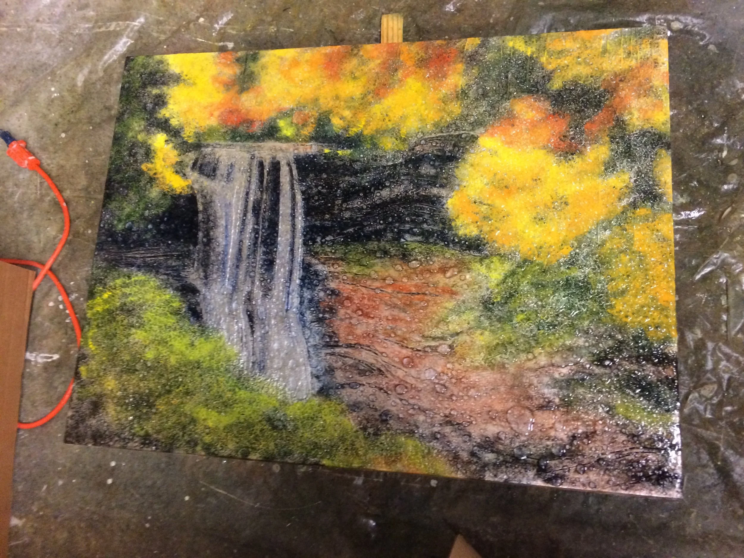
I usually don't show anyone what a half-completed painting looks like, but then I thought it might actually be interesting for friends to see. Every painting I do goes through what I call "the ugly stage" and these pieces, each approximately 50% complete, have JUST come out the other side of that ugly stage. Admittedly, they ain't beauties yet but they're not as hideous looking as they were a few days ago (trust me on that). When these pieces are complete, I'll post side-by-side photos (in process / finished) if people are interested.
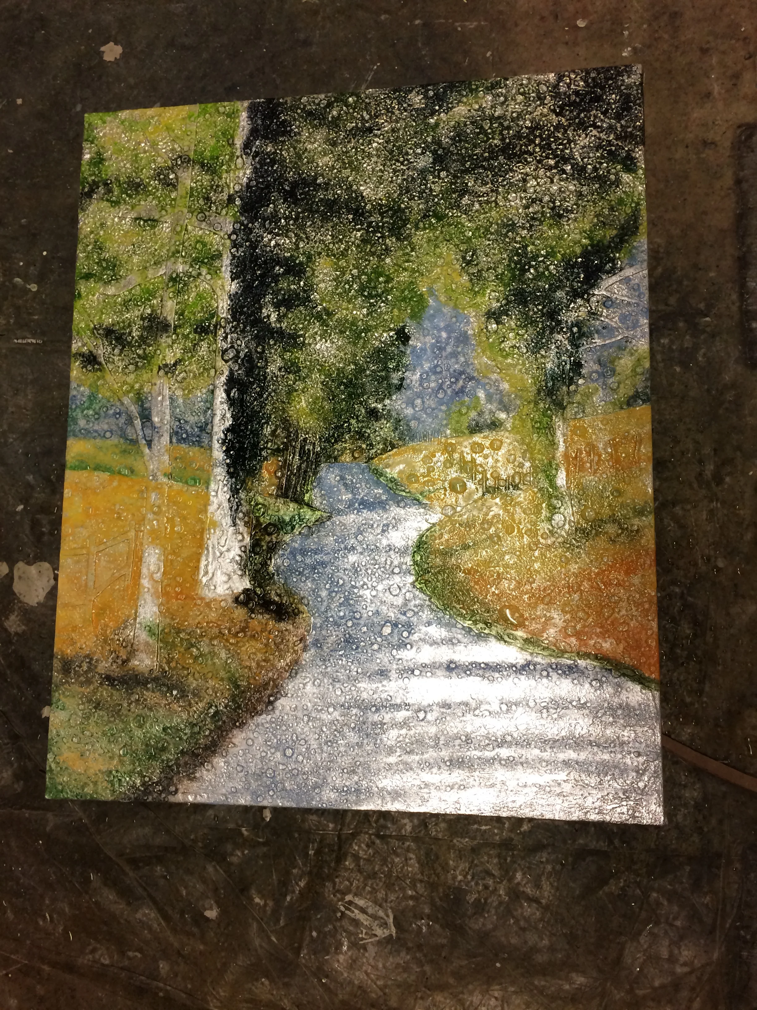
Oaks on the Water
"Oaks on the Water" (34" x 36")
This painting commission was an interesting assignment. About a month ago, I got a call from one of the owners of the art gallery in Charleston, SC that carries my work (Mitchell-Hill Gallery on King Street) and Michael Mitchell asked me about a commission based on two paintings I'd previously done. The photo Michael had sent me to use for inspiration was fused together in Photoshop, the upper half being two gnarled old oak trees and the lower half had a peaceful stream of still dark water (from a completely different piece). The original "oaks" painting was more of a summer scene, with green grass and a pathway or narrow road in the foreground, but I liked the idea of going to golds and more autumnal colors and I loved the idea of adding the stream. So I tackled the assignment with excitement.
Today, this painting is complete and will be packed up for shipment momentarily. I absolutely love taking an older painting and examining it again after some time and deciding to rework a new priced based on that original, tweaking it and "re-mixing it" so to speak. The process is a blast and the end result is usually well worth the effort.
Oak Tree by Bernard Shaw
I took an acorn and put it in a pot.
I then covered it with earth, not a lot.
Great pleasure was mine watching it grow.
The first budding green came ever so slow.
I watered my plant twice a week
I knew I would transplant it down by the creek.
One day it will be a giant oak,
To shield me from the sun a sheltering cloak.
Lovers will carve their initials in the bark,
An arrow through a heart they will leave their mark.
It will shelter those caught in a fine summers rain,
Under its leafy bows joy will be again.
Creatures of the wilds will claim it for their own,
Squirrels will reside here in their own home.
Birds will build nests and raise their young,
They will sing melodies a chorus well sung.
Under it’s branches grass will grow,
Here and there a wild flower it’s head will show.
My oak tree for hundreds of years will live.
Perhaps the most important thing I had to give.
Challenged to the Core

Usually, when I write these blogs, I think in terms of "what do I write about today? What might be the slightest bit interesting for some visitor to read?" Today is different. I am writing because I feel like if I don't, I'll burst.
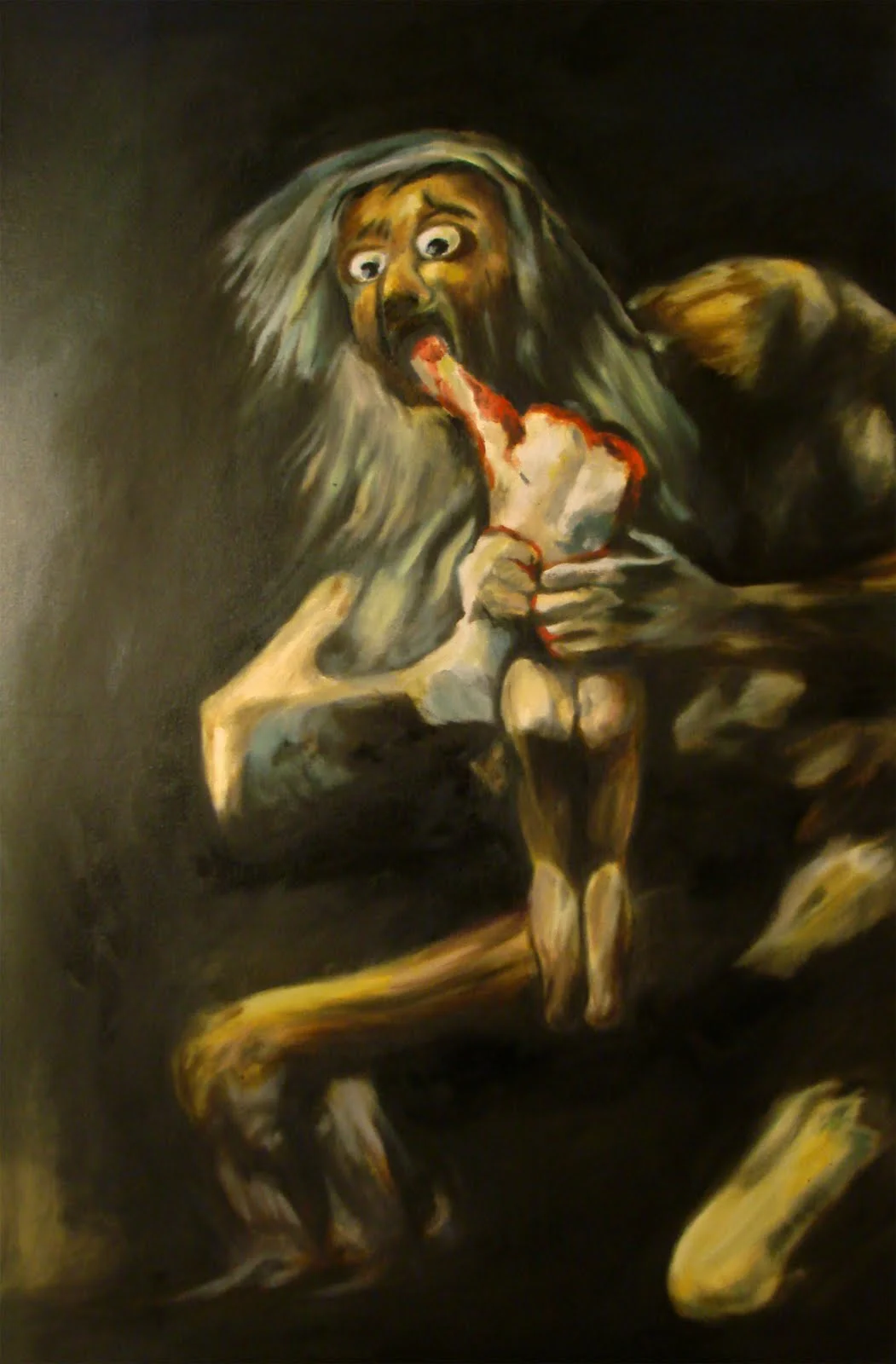
Yesterday, a gentleman visited my art studio here in Asheville and was really engaging with my paintings and my technique. This afternoon, he called me and asked if I would consider a commission, the theme of which would be the holocaust, and would that be okay or would it offend me.
I'm shaking right now actually. I have tried to use my skills as an artist to depict beauty and "sacred spaces" -- places (real or imagined) that just feel special, places where you would want to just sit a while and "drink it in" so to speak. I want to depict beauty and sacred spaces because I think that too often, I am confronted with ugliness and "profane spaces" in this world, and this is my way of at least doing something -- my own personal thing -- to balance things out. My purpose with art is to speak peace into an not-so-peaceful world. That's what I want to do. But to use my art to depict the deplorable, the unspeakable? How do I do that?
And yet...
Spanish artist Francisco Goya did that. He clearly depicted the deplorable. I would never hang his painting "Saturn devouring his Son" above the couch in my living room but it is an unspeakably powerful painting. It's his way of saying to the establishment -- "Hey, you are supposed to be protecting the people but instead, you are devouring them and you remind me of THIS!" -- a father devouring his son. Unspeakable, but powerful.
I have no idea if this commission will actually happen but it has affected me already. Can I just be really vulnerable and honest for a moment? See, I love the Jewish people and their history and their God. He has become my God and my faith tradition demands I love and respect these people. The holocaust is a personal affront and it all happened under the noses of people of my own faith tradition. They just let it happen. What do I do with that? I mourn. I mourn. I mourn.
So I think that, yes. I would be honored to use my art and depict horror...and hope. There is beauty in hope as well, right? I hope I get this assignment.
Boats on the Water
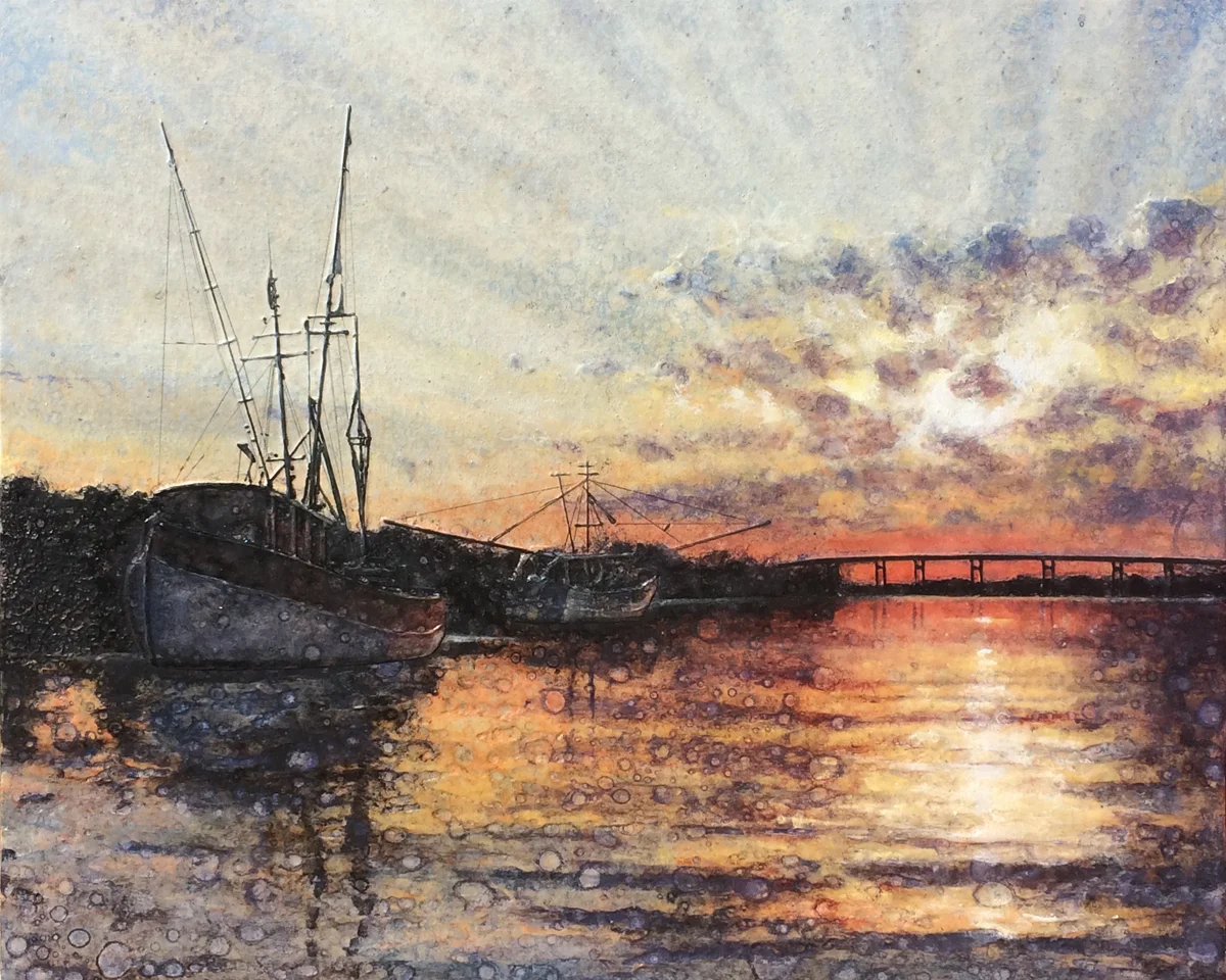
One of the best things about having an art studio in Asheville's River Arts District is that I can paint mountains and trees and water (which I thoroughly enjoy), and every time I run out of subject matter to inspire a painting, I just go for a walk and I'm full of ideas agin. The only difficult thing here is that I don't get to regularly paint subject matter that is outside the typical "Blue Ridge Mountain" genre. Do NOT get me wrong. I absolutely love paintings these mountains, but sometimes, it's just really fun to paint something different.
A couple months ago, I was asked to paint a couple sea-sunset themed paintings and I had a blast. I guess my client was happy because they since asked me to paint a third piece for them. "Are you up for a challenge?" they asked. Undaunted, I of course accepted that challenge.
To be honest, when I was given the photo to be used for this commission, I was nervous. The main subject of the photo were two shrimp boats (I think that's what they were) but the photo was really dark and I could see very little detail in the boats. So the trick was to suggest the detail I saw in the photo (the detail you'd see as silhouetted against a blazing sunset) and leave it at that. And a new challenge for me: how to suggest all the ropes and lines you'd see on shrimp boats without getting too much into the detail of it. Understand, the goal is to LOOK detailed without BEING detailed. If this painting looks right to you, then I figured it out, so...let me know. :)
A Paumanok Picture
by Walt Whitman
TWO boats with nets lying off the sea-beach, quite still,
Ten fishermen waiting--they discover a thick school of mossbonkers--
they drop the join'd seine-ends in the water,
The boats separate and row off, each on its rounding course to the
beach, enclosing the mossbonkers,
The net is drawn in by a windlass by those who stop ashore,
Some of the fishermen lounge in their boats, others stand ankle-deep
in the water, pois'd on strong legs,
The boats partly drawn up, the water slapping against them,
Strew'd on the sand in heaps and windrows, well out from the water,
the green-back'd spotted mossbonkers.
Glacial Fractures

"Glacial Fractures" (45" x 70")
About a month ago ago, I was asked to work on a commission. They requested an abstract painting based on the general idea of some other abstracts I've done in the past but they (very helpfully) requested I use the colors in Degas' "The Green Dancer" (shown below).
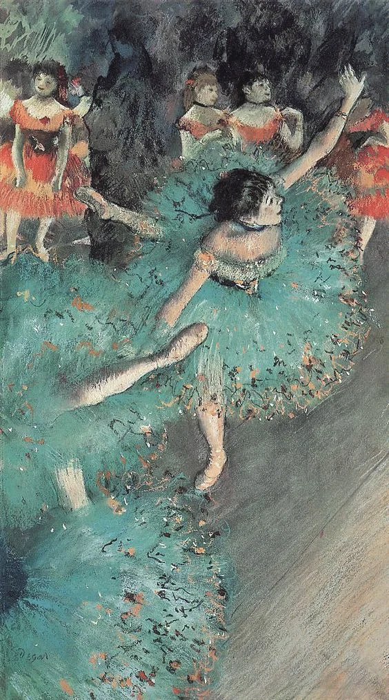
The reason I loved this assignment was, well, there were two reasons...First, I didn't have to search for colors that would work and second, it was so much fun color matching one of Degas' most famous pieces.
So my River Arts District art studio has been full of this really large painting now for about a month. It is scheduled to get its first layer of resin in the next couple of days (as soon as I get the gold leaf on the edges), and then it ships to Chicago. Honestly, I am going to miss looking at this one.
I named this piece "Glacial Fractures" because it when I stand back and ask what it wanted to be called, the night time image of towering glaciers in Antarctica came to mind. Of course, the glaciers are lit from within (probably due to the aliens trapped in the ice). Ha ha. Don't you go rolling your eyes at me. I'm an X-Files geek. I can't help myself.
Winter in the Summer!
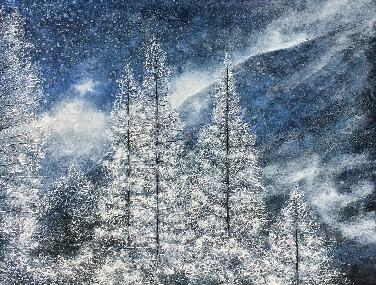
"Top of the Mountain" (18" x 22")
I have the tendency of being plagued with constant restlessness..."I'm too cold. I can't wait for summer"..."I'm too hot. I can't wait for winter". I have to remind myself to fully enjoy and appreciate where I am in the year, you know? I mean, each season has incredible beauty. I have learned two things living in a part of the country that gets four bonafide seasons:
1) Each season is a delight.
2) As an artist, winter always sells.
I have no idea why my second point is true. I would have thought a winter themed painting would be a "slow mover" when it comes to sales but my winter paintings are still selling in the summer so...being the keen entrepreneur that I am, I will continue to paint winter themes as longs as they sell. This painting in particular gives me great joy. It is called "Top of the Mountain" and features a stand of balsam trees heavily laden will snow. And as in most winter paintings, it is almost monochromatic. I think reducing a composition to nearly black and white (as you do in a winter scene) is really challenging and if pulled off right (hopefully!) is really dramatic.
So this summer, as you're about to enjoy a long weekend of inhaling bar-b-qued hot dogs, hamburgers and enjoying home made ice cream, remember...there are less than six months till Christmas.
Woods in Winter
by Henry Wadsworth Longfellow
When winter winds are piercing chill,
And through the hawthorn blows the gale,
With solemn feet I tread the hill,
That overbrows the lonely vale.
O'er the bare upland, and away
Through the long reach of desert woods,
The embracing sunbeams chastely play,
And gladden these deep solitudes.
Where, twisted round the barren oak,
The summer vine in beauty clung,
And summer winds the stillness broke,
The crystal icicle is hung.
Where, from their frozen urns, mute springs
Pour out the river's gradual tide,
Shrilly the skater's iron rings,
And voices fill the woodland side.
Alas! how changed from the fair scene,
When birds sang out their mellow lay,
And winds were soft, and woods were green,
And the song ceased not with the day!
But still wild music is abroad,
Pale, desert woods! within your crowd;
And gathering winds, in hoarse accord,
Amid the vocal reeds pipe loud.
Chill airs and wintry winds! my ear
Has grown familiar with your song;
I hear it in the opening year,
I listen, and it cheers me long.
What's in a Compliment?
Back in the day (when art classes in school were viewed as crucial for a well-rounded education), our art teachers probably taught us about the color wheel and we learned that colors opposite to each other on the wheel looked especially good together. These "opposite" colors are called "complimentary" to each other. This is all pretty basic stuff, Art101, but there is an actual scientific explanation why complimentary colors (yellow with purple, red with green, orange with blue) look so good with each other. See, it turns out that complementary colors are BFF's because cells in your eyes perceive various colors differently. For you doubters, try staring at a sheet of orange paper for a few minutes, then, look at a white wall. What do you see? Well, I'll tell you -- you will see a blue afterimage—orange's opposite color. This is because the cells in your eyes became tired, and do not fully express the visual spectrum you’ve been staring at. What you see on the wall is the white spectrum of light, sans a bit of blue, which your brain processes as orange.
Science and anatomy aside, complimentary colors are used all the time by designers and artists to visually accent a color. If a painting is mostly green landscape, I will always figure out where to use some red. If the piece is a sunset with fiery oranges and yellows, I will use blue and violet in the shadows. That blue and violet will not only look nice with the warm colors in the sky, but will also make them look even more intense.
Second use of a compliment...

But a second way I use complimentary colors (literally all the time, every day I paint) is to gray down an intense color straight from the tube. Let me explain. I'm looking out my art studio window right now and I see trees. What color are trees? Green, of course. So we pull out our tube and Sap green or Viridian green and paint the trees, right? Wrong! When you look closer at the green trees, they are not just a single generic green. Some of the green is more yellow, some is more blue and cool, and some is more of a gray-green. So how would you gray down a green? Add black? NO! Sorry for yelling. Never use black. All you do is to add just a bit of the complimentary color (in the case of green, this would be red) and viola! It's perfect. No black. Truth be told, I never, ever use black.
So, the use of complimentary colors are to painting what making a basic brown sauce is to French cooking. It's really basic and by tweaking it, you can use it for so many different and wonderful applications.
Okay, back to painting...
Blog Archive
-
2026
- Apr 1, 2026 Conversations Across Time: Leonardo da Vinci Apr 1, 2026
- Mar 29, 2026 A Closing Reflection: Nine Ways Beauty Finds Us Mar 29, 2026
- Mar 27, 2026 Type Nine: The Recognition of Wholeness Mar 27, 2026
- Mar 24, 2026 Type Eight: The Encounter with Unfiltered Reality Mar 24, 2026
- Mar 18, 2026 Type Seven: The Pursuit of Radiant Possibility Mar 18, 2026
- Mar 16, 2026 Type Six: Beauty as Trust, Stability, and the Restoration of Ground Mar 16, 2026
- Mar 11, 2026 Type Five: Beauty as Insight and Essential Understanding Mar 11, 2026
- Mar 8, 2026 Type Four: Beauty as Identity and Emotional Truth Mar 8, 2026
- Mar 5, 2026 Type Three: Beauty as Significance and Radiance Mar 5, 2026
- Mar 1, 2026 Type Two: Beauty as Loving Connection Mar 1, 2026
- Feb 26, 2026 Type One: The Pursuit of Perfected Beauty Feb 26, 2026
- Feb 22, 2026 Why Personality Shapes the Way We Create and Experience Art Feb 22, 2026
- Feb 11, 2026 My Most Ambitious Project to Date: Pont Neuf at Dusk Feb 11, 2026
- Feb 8, 2026 The Human Rhythm: Why the Golden Section Matters Feb 8, 2026
- Jan 31, 2026 Nature’s Quiet Mathematics: The Golden Section at Work Jan 31, 2026
- Jan 24, 2026 The Golden Section in Architecture: Building with Human Scale Jan 24, 2026
- Jan 16, 2026 The Golden Section in Music: Proportions You Can Feel Jan 16, 2026
- Jan 14, 2026 The Golden Ratio in Art: Where Math Meets Beauty Jan 14, 2026
-
2025
- Dec 25, 2025 Finding Peace in the Christmas Chaos Dec 25, 2025
- Dec 14, 2025 Seeing Meaning: How Medieval Art Spoke Without Words Dec 14, 2025
- Nov 19, 2025 The Matterhorn and the Magic of Transformation Nov 19, 2025
- Nov 13, 2025 Commissions vs Completed Pieces…Which is Right for You? Nov 13, 2025
- Oct 28, 2025 What can I learn from Makoto Fujimura in 2025? Oct 28, 2025
- Oct 12, 2025 What can I learn from Pablo Picasso in 2025? Oct 12, 2025
- Oct 10, 2025 What can I learn from Raphael in 2025? Oct 10, 2025
- Oct 8, 2025 What can I learn from Georgia O’Keefe in 2025? Oct 8, 2025
- Sep 28, 2025 What can I learn from Caravaggio in 2025? Sep 28, 2025
- Jul 25, 2025 What can I learn from Thomas Gainsborough in 2025? Jul 25, 2025
- Jul 20, 2025 What can I learn from Leonardo da Vinci in 2025? Jul 20, 2025
- Jul 15, 2025 What can I learn from Michelangelo in 2025? Jul 15, 2025
- Jul 2, 2025 What can I learn from Van Gogh in 2025? Jul 2, 2025
- Jun 25, 2025 What can I learn from Renoir in 2025? Jun 25, 2025
- Jun 23, 2025 What can I learn from Claude Monet in 2025? Jun 23, 2025
- Jun 21, 2025 Using Complimentary Colors for Shading Jun 21, 2025
- Jun 17, 2025 How and When to use Complimentary Colors Jun 17, 2025
- May 30, 2025 Perspective in Art 101: How to Make Your Drawings Pop Off the Page May 30, 2025
- May 26, 2025 How to Really Understand Medieval Art May 26, 2025
- May 22, 2025 Staying Creative May 22, 2025
- May 10, 2025 AT Experience May 10, 2025
- May 3, 2025 Go Take a Walk! May 3, 2025
- Apr 25, 2025 Periods of Art: Mannerism Apr 25, 2025
- Apr 17, 2025 Finding Meaning in the Abstract: Pointers for Understanding Modern Art Apr 17, 2025
- Apr 16, 2025 The Quiet Labor Apr 16, 2025
- Apr 12, 2025 To Art: a Poem Apr 12, 2025
- Apr 5, 2025 The Enchantment of Art Nouveau Apr 5, 2025
- Mar 23, 2025 "What was it like going to art school?" Mar 23, 2025
- Mar 18, 2025 Why I Love the Rococo Period Mar 18, 2025
- Mar 4, 2025 Expressing Joy Through Art Mar 4, 2025
- Feb 28, 2025 The Connection Between Art and Frustration Feb 28, 2025
- Feb 23, 2025 Neoclassicism: Bringing Ancient Style Back to Life Feb 23, 2025
- Feb 18, 2025 On my walk Feb 18, 2025
- Feb 12, 2025 Art at the Very Beginning Feb 12, 2025
- Feb 10, 2025 Monet and Renoir: A Personal Reflection on Their Differences Feb 10, 2025
- Feb 6, 2025 The Fount of Creation: A poem Feb 6, 2025
- Feb 1, 2025 The Connection Between Art and Grief Feb 1, 2025
- Jan 29, 2025 A Journey Through Medieval Art: Stories from the Middle Ages Jan 29, 2025
- Jan 26, 2025 The Story of Art: The Romantic Period Jan 26, 2025
- Jan 16, 2025 The Relationship Between Music and Painting Jan 16, 2025
- Jan 12, 2025 Periods of Art: Baroque Jan 12, 2025
- Jan 11, 2025 Marketing your Artwork Jan 11, 2025
- Jan 7, 2025 Exploring the Golden Ratio in Art Jan 7, 2025
- Jan 3, 2025 Artistic Enlightenment: Lessons from Italy Jan 3, 2025
-
2024
- Dec 29, 2024 Why Travel is Crucial for Unleashing Creativity Dec 29, 2024
- Dec 22, 2024 Steps to Becoming a Full-Time Professional Artist Dec 22, 2024
- Dec 10, 2024 How to Determine Subject Matter for Your Next Painting Dec 10, 2024
- Dec 3, 2024 My Favorite Artist Dec 3, 2024
- Dec 1, 2024 Creativity and Exploration Dec 1, 2024
- Nov 13, 2024 Impressionistic Heroes of Mine Nov 13, 2024
- Nov 10, 2024 "So how do you DO this?" Nov 10, 2024
- Nov 3, 2024 Discovering the Bond Between Nature and Art Nov 3, 2024
- Nov 1, 2024 How Art Can Help Us Cope with Stress Nov 1, 2024
- Oct 27, 2024 How to Select the Perfect Art for Your Home Oct 27, 2024
- Oct 24, 2024 What to Do When You Feel Like Giving Up as an Artist Oct 24, 2024
- Oct 14, 2024 Book Review: The Artist’s Way Oct 14, 2024
- Oct 11, 2024 How to find Inspiration for your art Oct 11, 2024
- Sep 24, 2024 Crafting the Perfect Title for Your Artwork Sep 24, 2024
- Sep 14, 2024 The Worst Advice I’ve Ever Received as an Artist Sep 14, 2024
- Sep 8, 2024 Overcoming Artist’s Block: Practical Tips Sep 8, 2024
- Aug 30, 2024 Exploring Lessons from Vincent van Gogh Aug 30, 2024
- Aug 29, 2024 Why Purchase Original Artwork? Aug 29, 2024
- Aug 25, 2024 How do you determine the best size artwork to purchase? Aug 25, 2024
- Aug 15, 2024 "So, what's this painting worth?" Aug 15, 2024
- Aug 9, 2024 What color art would go best in my home? Aug 9, 2024
- Aug 4, 2024 How to deal with criticism as an artist Aug 4, 2024
- Mar 27, 2024 Question 12: "What do you do when you have a mental block?" Mar 27, 2024
- Mar 27, 2024 New Goals + Winter Months = "Outside the Box" Creativity Mar 27, 2024
- Jan 8, 2024 Question 11: Where do you get inspiration for your work? Jan 8, 2024
-
2023
- Sep 11, 2023 Question 10: "Do you have your work in galleries?" Sep 11, 2023
- Aug 27, 2023 Question 9: "How do you manage the business side of your art business?" Aug 27, 2023
- Aug 20, 2023 Question 8: "Do you advertise?" Aug 20, 2023
- Aug 13, 2023 Question 7: "How do you price your work?" Aug 13, 2023
- Jul 30, 2023 Question 6: "What are the positive points and negative points about having an 'open studio'?" Jul 30, 2023
- Jul 19, 2023 Question 5: "Would you mind critiquing my work at some point?" Jul 19, 2023
- Jul 1, 2023 Question 4: "Would you recommend art school, and if so, how would you find the right one?" Jul 1, 2023
- Jun 24, 2023 Question 3: "Did you go to art school? If so, where?" Jun 24, 2023
- Jun 16, 2023 Question 2: "How long have you been selling your work professionally?" Jun 16, 2023
- Jun 10, 2023 Question 1..."How long have you been an artist?" Jun 10, 2023
- Jun 4, 2023 So, you're thinking about art as a career? Jun 4, 2023
- Mar 3, 2023 "What inspires you as an artist?" Mar 3, 2023
- Feb 15, 2023 Should I buy a completed painting OR commission a painting? Feb 15, 2023
- Jan 23, 2023 "How do you Price Your Work?" Jan 23, 2023
-
2022
- Dec 1, 2022 An Artist in Italy (Part 3) Dec 1, 2022
- Nov 16, 2022 An Artist in Italy (Part 2) Nov 16, 2022
- Nov 8, 2022 An Artist in Italy (Part 1) Nov 8, 2022
- Oct 10, 2022 When Remodeling a Home... Oct 10, 2022
- Aug 22, 2022 How to Handle Failure Aug 22, 2022
- Jun 3, 2022 "What is it like being an artist these days?" Jun 3, 2022
- May 21, 2022 "Are All Artists Introverts?" May 21, 2022
- May 9, 2022 What Makes a Painting a Good Piece of Art? May 9, 2022
- Apr 1, 2022 The Story Behind…"Gentle Showers on a Summer Afternoon" Apr 1, 2022
- Mar 19, 2022 The Story Behind..."Blue Ridge Summer Afternoon" Mar 19, 2022
- Feb 18, 2022 Your Opinion Please... Feb 18, 2022
- Jan 22, 2022 What's in a Compliment? Jan 22, 2022
-
2021
- Dec 25, 2021 My Christmas Present to Joy Dec 25, 2021
- Dec 12, 2021 Deep in the Heart Dec 12, 2021
- Nov 29, 2021 "How do you know you're done with a painting?" Nov 29, 2021
- Nov 1, 2021 Does it Matter What Other People Think of My Art? Nov 1, 2021
- Oct 12, 2021 Creatively Inhaling... Oct 12, 2021
- Aug 31, 2021 More Fun than I Know What to do With Aug 31, 2021
- Aug 13, 2021 “Are You Self Taught?” Aug 13, 2021
- Jul 21, 2021 New Art Gallery on the West Coast Jul 21, 2021
- Jun 23, 2021 "Art from the Heart" vs "Commissioned Art" Jun 23, 2021
- May 28, 2021 More Questions and Answers May 28, 2021
- May 17, 2021 What does Diversity have to do with honest artwork? May 17, 2021
- May 4, 2021 More Questions and Answers May 4, 2021
- Apr 30, 2021 Questions and Answers Apr 30, 2021
- Apr 16, 2021 And the Next Blog Post is... Apr 16, 2021
- Mar 10, 2021 How do you create when you don't feel like creating? Mar 10, 2021
- Feb 11, 2021 "Mullaghmore": The Story Behind the Painting Feb 11, 2021
- Jan 28, 2021 A Look Back to "The Dark Year" Jan 28, 2021
- Jan 17, 2021 Studio Expansion...Hello Northeast! Jan 17, 2021
- Jan 7, 2021 How to Create the Perfect Painting Jan 7, 2021
-
2020
- Dec 1, 2020 A personal answer to a personal question... Dec 1, 2020
- Nov 4, 2020 Using Art to Express my Politics Nov 4, 2020
- Oct 16, 2020 Sometimes, just "having fun" is a good enough reason Oct 16, 2020
- Oct 4, 2020 The Best Painting Delivery Ever... Oct 4, 2020
- Sep 7, 2020 How a Dinky Little Virus Changed my Art Business Sep 7, 2020
- Aug 9, 2020 Adaptation: Survival of the Most Flexible Aug 9, 2020
- Aug 3, 2020 Story Behind the Painting: "Sundown over the Blue Ridge" Aug 3, 2020
- Jul 18, 2020 Cure for Covid blues Jul 18, 2020
- Jul 5, 2020 Where Does it Take You? Jul 5, 2020
- Jun 3, 2020 Story Behind the Painting: Autumn Day on the French Broad River Jun 3, 2020
- May 24, 2020 Story Behind the Painting: Saint-Jean-Cap-Ferrat May 24, 2020
- Apr 30, 2020 Q&A: SESSION TWO Apr 30, 2020
- Apr 22, 2020 Q&A: SESSION ONE Apr 22, 2020
- Apr 8, 2020 What I'll Miss When This Pandemic is Over... Apr 8, 2020
- Mar 20, 2020 Entertaining Angels Unawares Mar 20, 2020
- Mar 8, 2020 In Celebration of Art Mar 8, 2020
- Feb 27, 2020 "The Bridge" Feb 27, 2020
- Feb 8, 2020 The Most Interesting Question of the Year (but it's only February so...) Feb 8, 2020
- Jan 29, 2020 "Can I Watch You?" Jan 29, 2020
- Jan 14, 2020 From Point A to Point Z Jan 14, 2020
- Jan 5, 2020 An Impractical Idea Jan 5, 2020
-
2019
- Dec 17, 2019 My Beautiful Baby on Display Dec 17, 2019
- Dec 3, 2019 Regarding the Selection of an Artistic Theme Dec 3, 2019
- Nov 20, 2019 "What's Your Best Price on This Piece?" Nov 20, 2019
- Nov 13, 2019 A Really Unique Commission Project Nov 13, 2019
- Nov 6, 2019 Fun with Art Scammers Nov 6, 2019
- Nov 3, 2019 "How did you know you wanted to be an artist?" Nov 3, 2019
- Oct 30, 2019 How do you know when a painting is "done"? Oct 30, 2019
- Oct 20, 2019 The piece I had to paint: "Côte d’Azur" Oct 20, 2019
- Oct 18, 2019 Inspiration Everywhere! Oct 18, 2019
- Aug 26, 2019 Contentment vs Restlessness Aug 26, 2019
- Aug 14, 2019 "Why Should I Purchase Artwork?" Aug 14, 2019
- Aug 11, 2019 What Was Art School Like? Aug 11, 2019
- Aug 7, 2019 "The Four Seasons on the French Broad River" Aug 7, 2019
- Jul 30, 2019 Joy Unspeakable Jul 30, 2019
- Jul 7, 2019 Of Mountains and Oceans Jul 7, 2019
- Jul 3, 2019 Lessons I've Learned as an Artist Jul 3, 2019
- Jun 26, 2019 St.Claire Art Opening at the AC Hotel, Asheville Jun 26, 2019
- Jun 23, 2019 "How do you decide what to paint?" Jun 23, 2019
- Jun 5, 2019 One of my All-Time Heroes Jun 5, 2019
- Jun 2, 2019 Regarding "Inspiration" vs "Necessity" Jun 2, 2019
- May 29, 2019 The Best Complement I've Ever Received May 29, 2019
- May 19, 2019 "What are you Working on These Days?" May 19, 2019
- May 5, 2019 "Frankenstein-ing" a painting May 5, 2019
- Apr 17, 2019 The Big Reveal Apr 17, 2019
- Apr 3, 2019 "How do you Decide What to Paint?" Apr 3, 2019
- Mar 27, 2019 "I'm just not making the sales I need!" Mar 27, 2019
- Mar 20, 2019 Making the Most of Mistakes Mar 20, 2019
- Mar 10, 2019 Exploring Austin Galleries, Part 2 Mar 10, 2019
- Feb 25, 2019 Exploring Austin Galleries, Part 1 Feb 25, 2019
- Feb 10, 2019 Progress! Feb 10, 2019
- Jan 23, 2019 Preliminary Photos of my "Sails" Prototypes Jan 23, 2019
- Jan 16, 2019 The Benefits of Slowing Down Jan 16, 2019
- Jan 8, 2019 New Idea Taking Shape Jan 8, 2019
-
2018
- Dec 29, 2018 Looking Back and Looking Ahead Dec 29, 2018
- Dec 19, 2018 Percolating Creativity Dec 19, 2018
- Dec 16, 2018 So then... Dec 16, 2018
- Dec 12, 2018 What if... Dec 12, 2018
- Dec 5, 2018 Recent Projects on my Plate Dec 5, 2018
- Dec 3, 2018 Claude: My Creative Hero and Muse Dec 3, 2018
- Nov 22, 2018 Lessons I've Learned as an Artist Nov 22, 2018
- Nov 12, 2018 Planning for a Second Studio Location! Nov 12, 2018
- Nov 7, 2018 Steps Involved with a Painting Commission Nov 7, 2018
- Nov 4, 2018 How do you stay "balanced"? Nov 4, 2018
- Oct 28, 2018 What makes art "Art"? Oct 28, 2018
- Oct 21, 2018 "How Did You Stumble Across This Type of Artwork?" Oct 21, 2018
- Oct 17, 2018 "A Personal History" Oct 17, 2018
- Oct 14, 2018 Commission Confusion Oct 14, 2018
- Oct 10, 2018 "Aqueous Dream" Oct 10, 2018
- Oct 7, 2018 Beauty in the Center of the Pit Oct 7, 2018
- Sep 30, 2018 Only North Carolina? Sep 30, 2018
- Sep 23, 2018 The Price of Being a Landscape Painter Sep 23, 2018
- Sep 9, 2018 Thoughts on New Directions, New Possibilities Sep 9, 2018
- Aug 29, 2018 SURVEY: GLOSSY OR SATIN Aug 29, 2018
- Aug 22, 2018 Regarding Commissioning a Painting Aug 22, 2018
- Aug 19, 2018 On the Brink of a Huge Failure Aug 19, 2018
- Aug 7, 2018 "The Trail That Never Ends" Aug 7, 2018
- Aug 5, 2018 Inspration Begets Inspiration Aug 5, 2018
- Jul 19, 2018 Rejuvenating Creativity! Jul 19, 2018
- Jul 15, 2018 A Word About Accolades Jul 15, 2018
- Jul 10, 2018 Where it Began Jul 10, 2018
- Jul 4, 2018 Funny Things People Say in an Art Studio Jul 4, 2018
- Jun 29, 2018 "The Time Between Times" Jun 29, 2018
- Jun 27, 2018 World View #8: Post Modernism Jun 27, 2018
- Jun 21, 2018 World View #7: New Age Pantheism Jun 21, 2018
- Jun 12, 2018 A New Opportunity -- A New Idea Jun 12, 2018
- Jun 6, 2018 The Art of Dinner (at the Grove Park Inn) Jun 6, 2018
- Jun 3, 2018 National Geographic?!? Jun 3, 2018
- Jun 1, 2018 World View #6: Modernism Jun 1, 2018
- May 24, 2018 The Art of Dinner (with the Dallas Cowboys) May 24, 2018
- May 13, 2018 Carving Mountains from Scratch May 13, 2018
- May 10, 2018 "Trigger Warning" May 10, 2018
- May 7, 2018 World View #5: Existentialism May 7, 2018
- Apr 29, 2018 World View #4: Nihilism Apr 29, 2018
- Apr 11, 2018 World View #3: Naturalism Apr 11, 2018
- Apr 4, 2018 World View #2: Deism Apr 4, 2018
- Mar 26, 2018 World View #1: Theism Mar 26, 2018
- Mar 23, 2018 A Time to be Disturbed Mar 23, 2018
- Mar 14, 2018 Understanding Art 101 Mar 14, 2018
- Mar 8, 2018 The Organ Mountains Mar 8, 2018
- Mar 7, 2018 "Remember...there are no mistakes with art" Mar 7, 2018
- Mar 2, 2018 The Biltmore Estate Mar 2, 2018
- Feb 21, 2018 How to Make a Living as an Artist (Part 2) Feb 21, 2018
- Feb 12, 2018 How to Make a Living as an Artist Feb 12, 2018
- Feb 4, 2018 How do you create when you don't feel creative? Feb 4, 2018
- Jan 24, 2018 Gallery Representation in Hendersonville! Jan 24, 2018
- Jan 19, 2018 Metalizing the Biltmore Estate Jan 19, 2018
- Jan 15, 2018 Four Seasons on the Blue Ridge Jan 15, 2018
- Jan 11, 2018 About Ice... Jan 11, 2018
- Jan 10, 2018 What's Next? Jan 10, 2018
-
2017
- Dec 20, 2017 Mountain Top Experiences Dec 20, 2017
- Dec 18, 2017 The Power of Mystery Dec 18, 2017
- Dec 7, 2017 Forsyth Park Fountain Dec 7, 2017
- Dec 6, 2017 Angsty or Terrified? Dec 6, 2017
- Dec 4, 2017 To the "Angsty" Artist... Dec 4, 2017
- Dec 3, 2017 "I woudn't pay HALF of what he's asking!" Dec 3, 2017
- Nov 20, 2017 "On the Water" Nov 20, 2017
- Nov 19, 2017 Song of Autumn Nov 19, 2017
- Nov 15, 2017 "Top of the Mountain" Nov 15, 2017
- Nov 5, 2017 "How do you decide what to paint?" Nov 5, 2017
- Nov 2, 2017 "Valley of Shadows" Nov 2, 2017
- Nov 1, 2017 Forest of Autumn Gold Nov 1, 2017
- Oct 25, 2017 Then and Now Oct 25, 2017
- Oct 24, 2017 Catawba Falls Oct 24, 2017
- Oct 18, 2017 "Valley of Shadows" Oct 18, 2017
- Oct 11, 2017 Autumn River Song Oct 11, 2017
- Oct 3, 2017 Autumnal Shift Oct 3, 2017
- Sep 28, 2017 Mystic Summer Morning Sep 28, 2017
- Sep 24, 2017 Valley of Shadows Sep 24, 2017
- Sep 1, 2017 the breakers Sep 1, 2017
- Aug 24, 2017 When the Sun Went Dark Aug 24, 2017
- Aug 17, 2017 Secret Blog Post Aug 17, 2017
- Aug 14, 2017 Waterfalls Everywhere! Aug 14, 2017
- Aug 11, 2017 "Cullasaja Falls" Completion photo Aug 11, 2017
- Aug 8, 2017 Finishing up "My Marathon" Aug 8, 2017
- Aug 1, 2017 One of the Best Days Ever! Aug 1, 2017
- Jul 26, 2017 "Glacial Fractures in situ" Jul 26, 2017
- Jul 24, 2017 Inspiration and Rest Jul 24, 2017
- Jul 18, 2017 Half Baked Ideas... Jul 18, 2017
- Jul 13, 2017 Oaks on the Water Jul 13, 2017
- Jul 9, 2017 Challenged to the Core Jul 9, 2017
- Jul 5, 2017 Boats on the Water Jul 5, 2017
- Jun 30, 2017 Glacial Fractures Jun 30, 2017
- Jun 29, 2017 Winter in the Summer! Jun 29, 2017
- Jun 27, 2017 What's in a Compliment? Jun 27, 2017
- Jun 23, 2017 Thoughts on a Mighty Failure Jun 23, 2017
- Jun 20, 2017 Sunrise on the Mountain Jun 20, 2017
- Jun 14, 2017 The Last Sunset (is that dramatic or what?) Jun 14, 2017
- Jun 12, 2017 Sunset or Sunrise? End or Beginning? Jun 12, 2017
- Jun 9, 2017 At the End of the Day Jun 9, 2017
- Jun 8, 2017 Giverny: My Homage to the Man Jun 8, 2017
- Jun 2, 2017 A Funny Thing Happened at the Studio Today... Jun 2, 2017
- Jun 2, 2017 Sunrise, Sunset... Jun 2, 2017
- May 29, 2017 Color Explosion May 29, 2017
- May 22, 2017 My Largest Painting to Date... May 22, 2017
- May 18, 2017 What to do with 2000 visitors in an art studio... May 18, 2017
- May 9, 2017 My Creative Muse May 9, 2017
- May 3, 2017 Joys of Life May 3, 2017
- Apr 28, 2017 Regarding Art & Beauty Apr 28, 2017
- Apr 25, 2017 Getting Better Acquainted Apr 25, 2017
- Apr 23, 2017 Rainy Sunday Morning Thoughts Apr 23, 2017
- Apr 22, 2017 Personal Thoughts Apr 22, 2017
- Apr 19, 2017 Favorite Hikes (Inspiration in the Making)... Apr 19, 2017
- Apr 15, 2017 Inspiration is Everywhere (some of our favorite hiking trails) Apr 15, 2017
- Apr 9, 2017 "Where should we eat tonight?" Apr 9, 2017
- Apr 6, 2017 Who Else Should We See in the District? Apr 6, 2017
- Apr 1, 2017 Spring in Western North Carolina Apr 1, 2017
- Mar 29, 2017 "Can you really make a living here?" Mar 29, 2017
- Mar 25, 2017 Of Ruination and Rescue Mar 25, 2017
- Mar 21, 2017 How I decide what to paint... Mar 21, 2017
- Mar 18, 2017 Musings of an artist... Mar 18, 2017
- Mar 14, 2017 Winter thoughts Mar 14, 2017
- Mar 13, 2017 "What makes this painting so sparkly?" Mar 13, 2017
- Mar 10, 2017 You're From Where? Mar 10, 2017
- Mar 5, 2017 "No Boundaries" Mar 5, 2017
- Mar 3, 2017 Appalachian Trail Mar 3, 2017
- Mar 2, 2017 What is 'good' art? Mar 2, 2017
- Feb 26, 2017 A Trip to the Art Museum Feb 26, 2017
- Feb 23, 2017 "The Rules" of Art Feb 23, 2017
- Feb 15, 2017 To School or Not to School... Feb 15, 2017
- Feb 10, 2017 How Do I Start This Thing? Feb 10, 2017
- Feb 9, 2017 Rocky Mountains reflection Feb 9, 2017
- Feb 7, 2017 Getting Inspired Feb 7, 2017
- Feb 5, 2017 Inspiration for a painting... Feb 5, 2017
- Jan 31, 2017 Understanding Abstract Art Jan 31, 2017
- Jan 29, 2017 Chi Jan 29, 2017
- Jan 26, 2017 Process: Rocky Mountain Commission Jan 26, 2017
- Jan 12, 2017 "Summer Path Thru the Birch Trees" Jan 12, 2017
- Jan 9, 2017 "Daybreak" Jan 9, 2017
-
2016
- Dec 31, 2016 Revisiting a friend Dec 31, 2016
- Dec 28, 2016 The Trial Run Dec 28, 2016
- Dec 17, 2016 Asheville Channel Interview Dec 17, 2016
- Nov 28, 2016 "Big Mamma" begins to sing.... Nov 28, 2016
- Nov 22, 2016 An Experiment with Moonlight Nov 22, 2016
- Nov 17, 2016 Transfiguration Nov 17, 2016
- Nov 11, 2016 My Cluttered World Nov 11, 2016
- Oct 30, 2016 Sacred Space Oct 30, 2016
- Oct 22, 2016 Omikron (Fire & Ice) Oct 22, 2016
- Oct 19, 2016 "Do you know what you're going to paint?" Oct 19, 2016
- Oct 15, 2016 "Golden Pathway" Oct 15, 2016
- Oct 14, 2016 Flowers, Flowers Everywhere Oct 14, 2016
- Oct 13, 2016 OKC 2 ("The Bridge") Oct 13, 2016
- Oct 12, 2016 Headed west... Oct 12, 2016
- Sep 7, 2016 A Year of "Largest" Sep 7, 2016
- Aug 2, 2016 Transformation of an idea... Aug 2, 2016
- Jul 27, 2016 Beginning my "marathon" painting: Cullasaja Falls Jul 27, 2016
- Jul 18, 2016 My Marathon Jul 18, 2016
- Jul 13, 2016 Welcome! Jul 13, 2016
- Jul 11, 2016 Aegean Waters Jul 11, 2016
- Jul 2, 2016 The Red Planet Jul 2, 2016
- Jun 17, 2016 Puzzling and Playing Jun 17, 2016
- Jun 10, 2016 St.Claire Art Studio Tour Jun 10, 2016
- Jun 6, 2016 Hominy Valley Jun 6, 2016
- May 25, 2016 "The Acolytes" is installed in Georgetown, SC May 25, 2016
- May 19, 2016 "Zuma" May 19, 2016
- May 18, 2016 Fishy Art May 18, 2016
- May 13, 2016 "The Journey" May 13, 2016
- May 10, 2016 Hyatt Ridge (26" x 16") May 10, 2016
- May 5, 2016 "Broad River in October" May 5, 2016
- May 2, 2016 A Blast From the Past May 2, 2016
- Apr 22, 2016 Beginnings II Apr 22, 2016
- Apr 21, 2016 Appalachian Panorama Apr 21, 2016
- Apr 18, 2016 "How do you get the aluminum on the painting?" Apr 18, 2016
- Apr 14, 2016 Beginnings Apr 14, 2016
- Mar 24, 2016 St. Claire Art News & Updates Mar 24, 2016
- abstract
- aluminum leaf
- Appalachian Trail
- art as a career
- art business
- art career
- art career advice
- art commission
- art composition
- art creation
- art critique
- art education
- Art Gallery
- art gallery
- art history
- art inspiration
- art marketing
- art movements
- art periods
- art poetry
- art process
- art purchase
- art sales
- art school
- Art Studio
- art studio
- art studios
- Art Studios
- art technique
- artist
- Artist advice
- artist advice
- artist representation
- artisti creation
- artistic expression
- artistic inspiration
- artwork
- Artwork
- Asheville
- asheville
- Asheville art gallery
- Asheville art studio
- Asheville artist
- Asheville artists
- Autumn
- autumn
- birch
- blue
- Blue Ridge
- commission
- Commission
- complimentary colors
- contemporary art
- creative inspiration
- Creativity
- creativity
- cullasaja falls
- fine art
- golden section
- grief
- grove park inn
- Hiking
- impressionism
- inspiration
- installation art
- landscapes
- medieval art
- mountain trails
- mountains
- North Carolina
- ocean
- ocean artwork
- oil painting
- Oil paintings
- origins
- process
- Professional artist
- red
- reflection
- Renoir
- Resin art
- River
- River Arts District
- Statement peice
- studio
- summer
- sunset
- Sunset
- travel
- travel and creativity
- trees
- understanding art
- unique wall art
- water
- waterfall
- wave
- western north carolina
- Western North Carolina
- woods
- World Views